I Had A Colour Consultation To Coordinate My Forever Home – Here’s What Happened
By
42 minutes ago
Help! How do I choose the right paint colours?
In need of some serious interiors guidance, Lucy Cleland calls in the experts from Edward Bulmer Natural Paint for a top-to-bottom colour consultation.
I Tried A Colour Consultation With Edward Bulmer Natural Paint
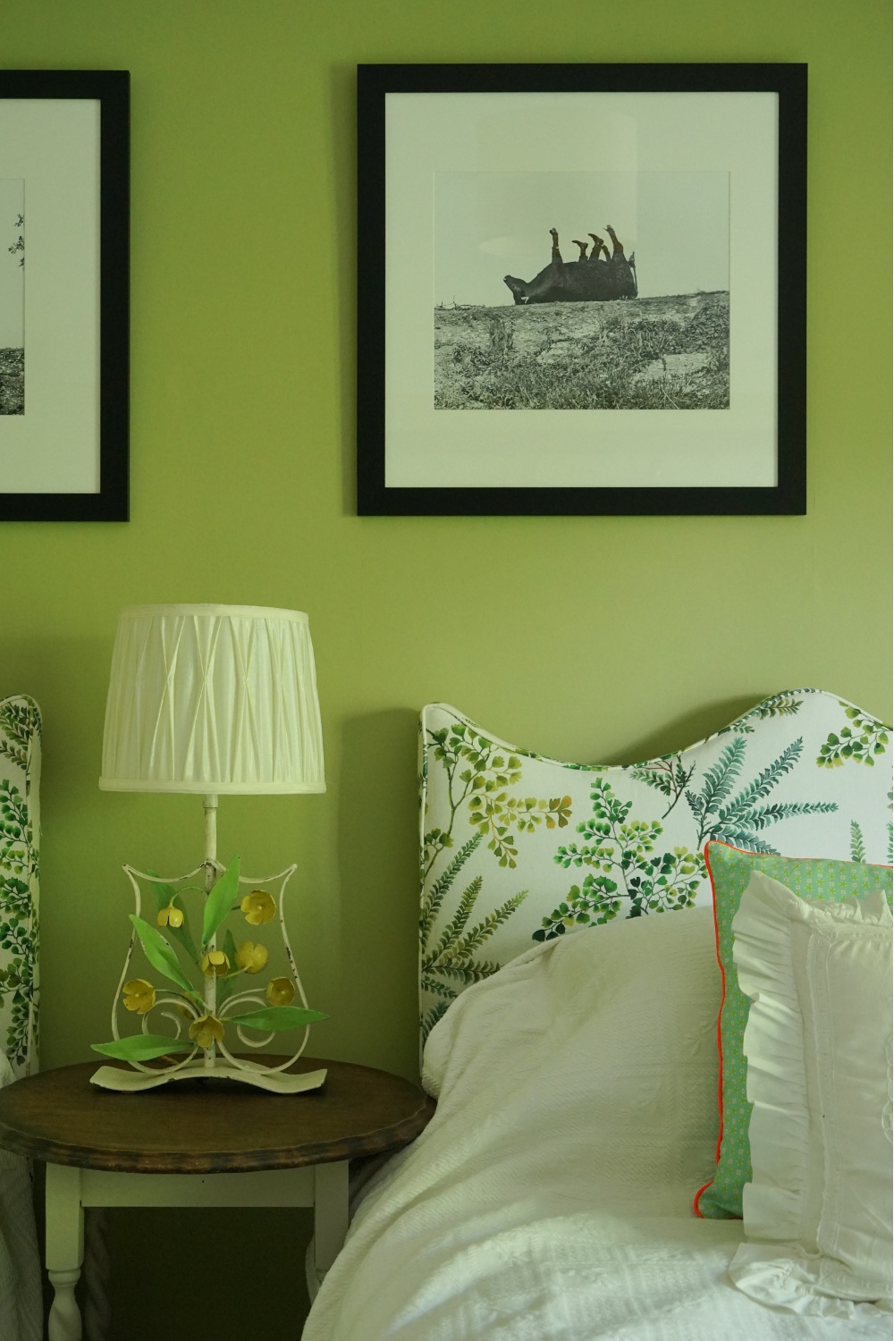
Choosing paint colours for my (possibly forever) home is something I thought I would be really good at. I’m supposed to be creative after all. I thought I could do it all alone, choosing an Elephant’s Breath here and a Hopper Green there, creating a symphony of sumptuous hues in my home. These colours would not only augment my feelings of wellbeing whenever I stepped through the door but would nod to my personality. People would judge me on my colour choice. They’d find it strong, bold, quirky and calming all at once.
Now, I’m not sure about you, but I’m not keen on being judged. And have you ever tried to decide between a Spanish or a Fine white? Or whether the colour should go above the picture rail, round the skirting – and what about the built-in shelves?
Edward Bulmer
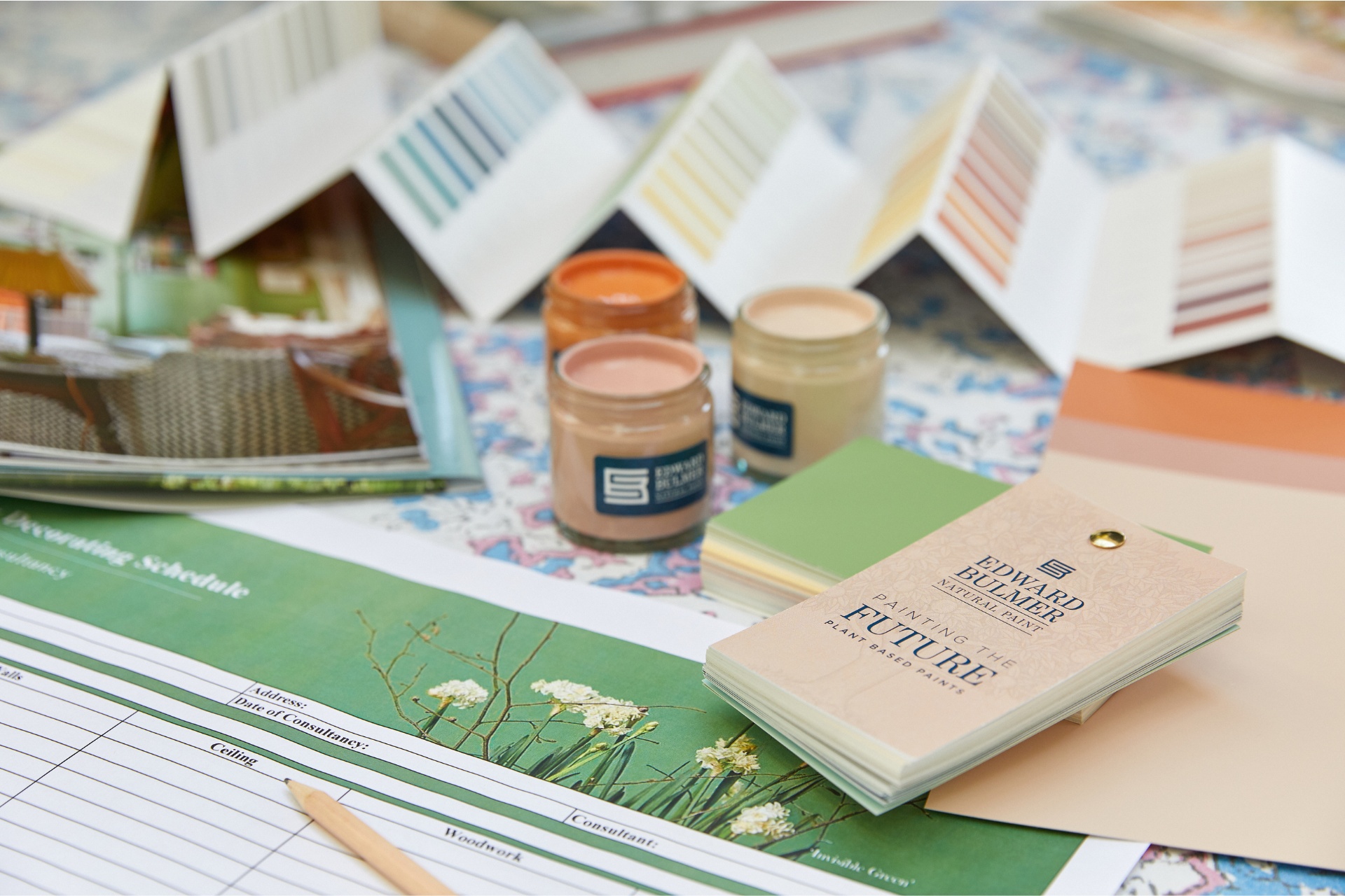
So, 25 samples later with my kitchen, hall and sitting room looking like a multicoloured zebra and I’m no closer to choosing whether my combination of pink and green or blue and yellow are my go-tos for the kitchen. It’s time for some hand-holding; I’m calling a colour emergency. Enter Lena Dahnsjo, colour consultant at Edward Bulmer Natural Paint, who create to order the most beautiful colours in fantastically sustainable ways.
The Process
We sit in my kitchen and I ask her how this works, because I really want to get this painting party started. ‘I tend to go in without ideas,’ Lena tells me. ‘We’ll sit down like we are now and talk about why you’ve chosen Edward Bulmer [because I think the materials you use in your space are important], what you’re drawn to [pinks, mauves, greens] and then we walk the house together.’
Luckily I’ve mood-boarded in advance – photos of a beautiful light terracotta pink from a restaurant we went to in Fowey, Lily Allen’s insanely gorgeous drawing room in the Brooklyn brownstone that she shared with her love rat husband David Harbour, a layered up pink sitting room from World of Interiors. There’s a theme here: I’m clearly drawn to pink and green as a colour combo. But I can’t have that in every room. We start our tour.
Lena, it turns out, is good at reading a room: how it’s used, what time of day the light falls across it, what furniture there is, whether curtains have already been chosen. It is, as she puts it, about ‘personality and character’.
Edward Bulmer
Lena’s background explains her instinctive approach. Originally Swedish, trained in art history and the history of architecture, with years working in textiles and fashion, she speaks about interiors in the way a fashion designer might talk about materials. Colour is not, it turns out, flat; it reacts, it moves.
And nowhere more so than with natural pigment paint. ‘Our colours are quite different,’ she explains. ‘Because they’re all natural mineral and earth pigments, they’re so responsive to light. You get this look that you really don’t get with other paints, which is pigmented but soft at the same time. Even I can’t always foresee exactly what they’ll do in a specific room.’
A shade that looks sophisticated in one corner can look entirely different by afternoon. She encourages clients to live with sample cards for days (these cards are much more sustainable than the endless mini paint samples I already got over-excited about ordering), ideally a week. ‘It is really important to try them out and get a feel for them,’ she says.
We talk about being ‘brave’ with fashion, yet remain strangely cautious with walls. Actually, I think I’m the opposite. I would say my fashion is pretty understated, and it’s the walls where I’m going to go splashy. With most clients, Lena says they’re convinced that they know exactly what they want, but by the end of their walk-through, they’ve chosen something entirely different. ‘I quite like it when, at the end, they say, “These are colours I would never have thought about.”’
Edward Bulmer
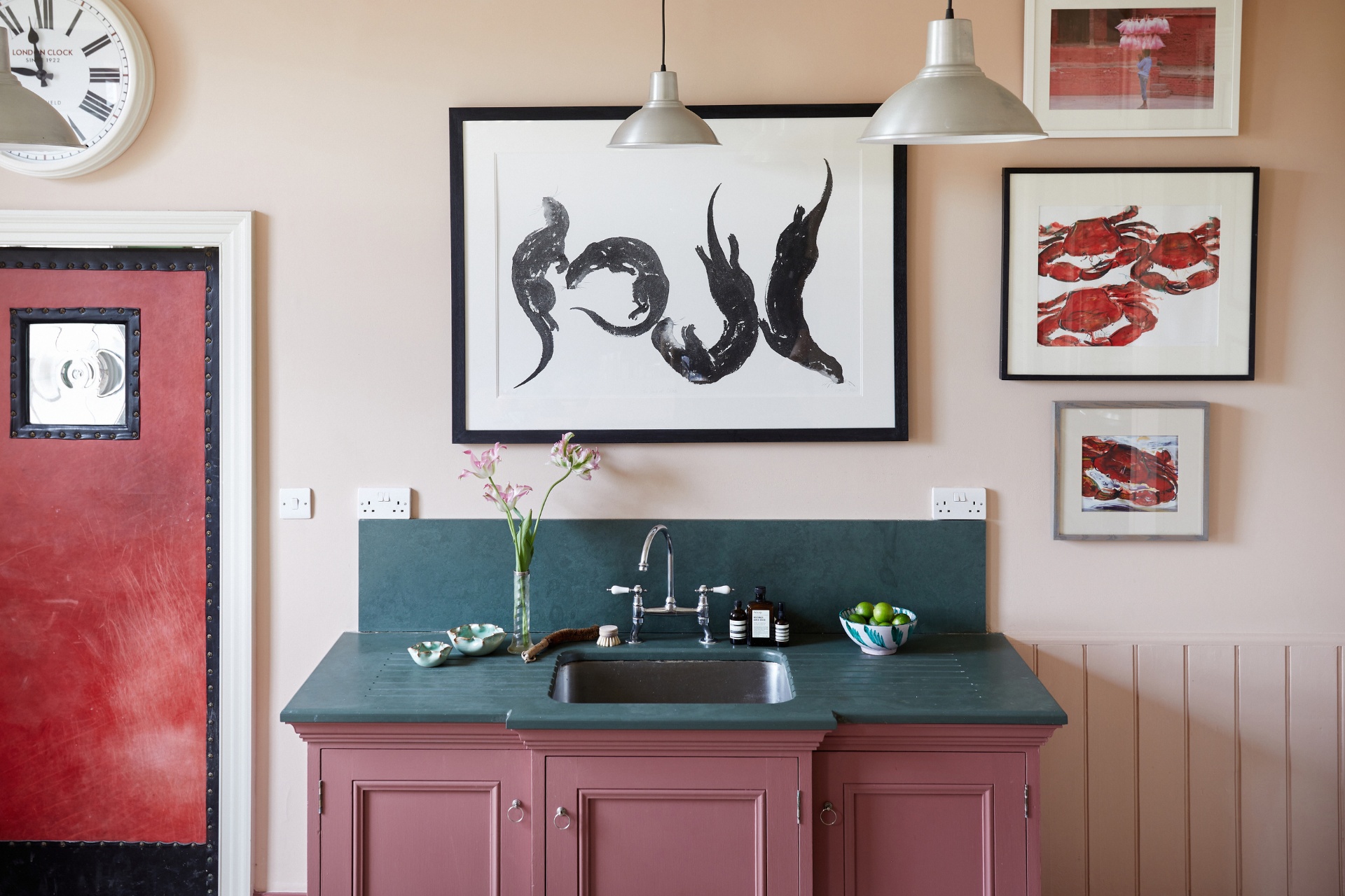
What delights me is that she nails my lusted-after terracotta pink with a colour called Hespan. It’s just perfect and will be painted over the current sickly blancmange pink it is now – skirting, back of door, and shelving too – up to and including the picture rail. Above that will be Spanish white (one of their most popular and the colour I will use for all ceilings and wherever a white is called for). I’m pairing it with a large red and white striped rug which I’ve ordered from Etsy – I’ve become obsessed with stripes recently and a big old circus stripe has got me all excited (you should see what I’m doing in the bathrooms with wallpaper).
Upstairs, we land on the most splendid blue for my 12-year-old son: French blue, which is rich and strong and won’t embarrass him when he’s 17. For my daughter, who wanted to avoid pink (‘too girly’), we found a very pale pretty blue called Aerial Tint 40 percent.
This is such fun and actually I’m better at it than I thought I was. But having Lena pull out her colour swatches and giving me a massive confidence boost is absolutely what I need because the world of colour is so overwhelming. And you can be easily seduced by a name; and put off by another. Who wants to splash the Dead Salmon about? It makes my nose crinkle just to think about it.
I finally conjure up my dream kitchen colours too with Lena’s help. Pink, of course, mustard yellow and teal. Punchy. I told you so, just don’t judge me.
Try It
Colour consultancy with Edward Bulmer starts from £275 for two hours. Find out more here.