


Behind The Scenes Of Formations, The Latest Collection From Cole & Son
By
8 hours ago
C&TH gets the inside scoop from the brand's head of design
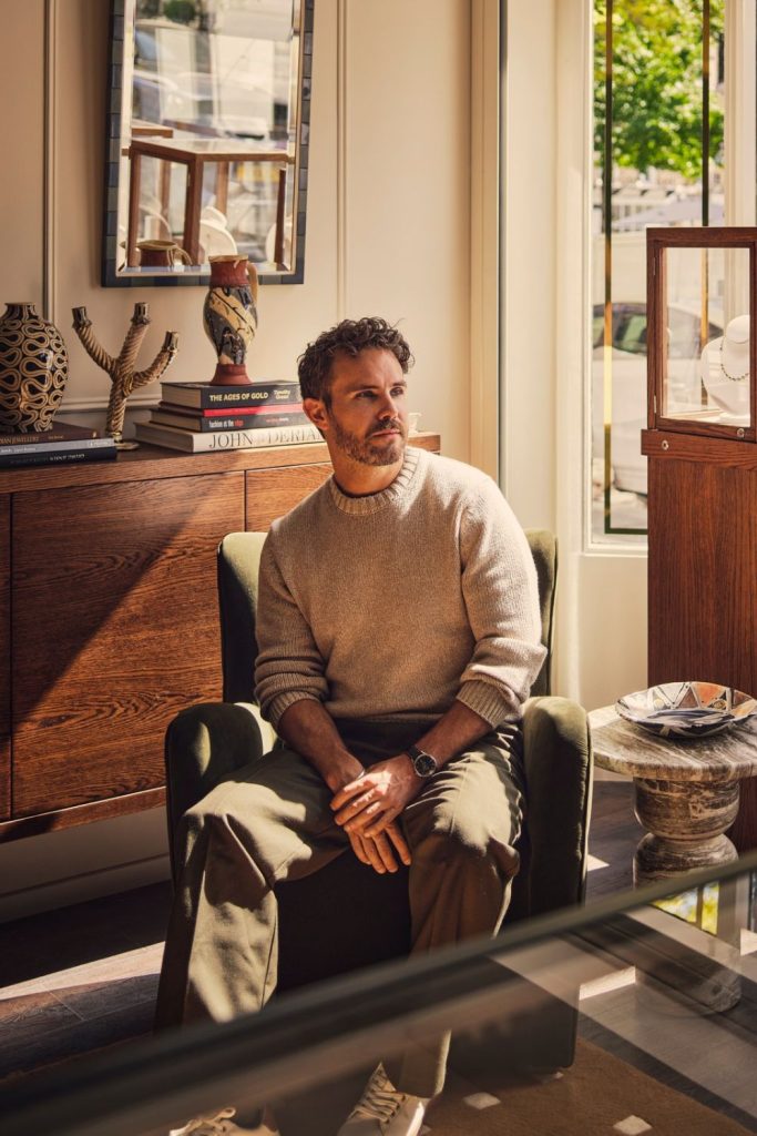
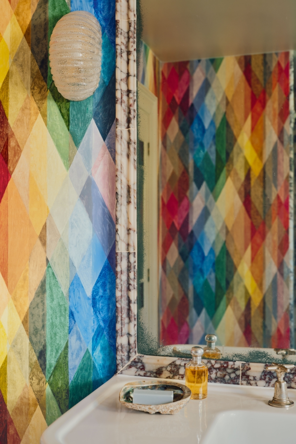
Print and pattern are so often features that give a house the personality of a home. No one knows this better than Cole & Son, which recently launched Formations – a new collection of wallpapers that reinterpret the geometric language found in the design house’s archives. As the collection launches online, C&TH interiors editor Carole Annett chats to Chase Hafer, head of design at Cole & Son, to hear more about her work with the brand, the role of heritage in new collections and the story behind Formations.
Cole & Son On New Collection Formations

Chase Hafer
Hi Chase, welcome. Can you kick us off by telling our readers about your role at Cole & Son?
Thank you! Hi, I’m Chase Hafer. I’m the head of design at Cole & Son, so I lead a team of three full-time designers, directing the overall design direction and developing the focus for each collection.
Can you fill us in on your creative background?
I am both a textile designer and a fine artist, an oil painter, by training. I received my BFA in Painting through a coordinated program between the University of Pennsylvania and the Pennsylvania Academy of Fine Arts back home in the US. Pattern, colour and a dedication to excellence in craft were always at the core of my practice, and it was these guiding principles that led me to study textile design in Italy – weaving, batik, print design, all of these different disciplines which opened up a whole new world and methodology for me. I moved to London to get my master’s in Textiles at the Royal College of Art and have been living and working here ever since.
What drew me to Cole and Son is the opportunity to work at that intersection, of fine art and design, which is incredible.
What excites you most about working with Cole & Son?
I like creating things that are genuinely valued. I also love the dynamism of the archive and the portfolio. We can work on something like Formations, with its particular energy and cadence, and then move on to a completely different project. Being able to operate across those different creative worlds is very stimulating.
Cole & Son
When you are planning a new collection, you often look back at heritage prints. What are you searching for?
It always starts with the story we want to tell. We look at what feels relevant now, then explore the archive and the world around us to find the right narrative. Formations, our latest collection, reinterprets geometrics. Cole & Son has a strong history with geometric design, particularly during the 1950s, when we had our own screen-printing studio. The new technology made wallpaper production more accessible and allowed for creative experimentation. At the time, the design director, Richard Spelling, invited students from the Royal College of Art to develop designs. It created this wonderful exchange between technology and creativity, resulting in designs that the market hadn’t seen before.
Why was that so relevant for Formations?
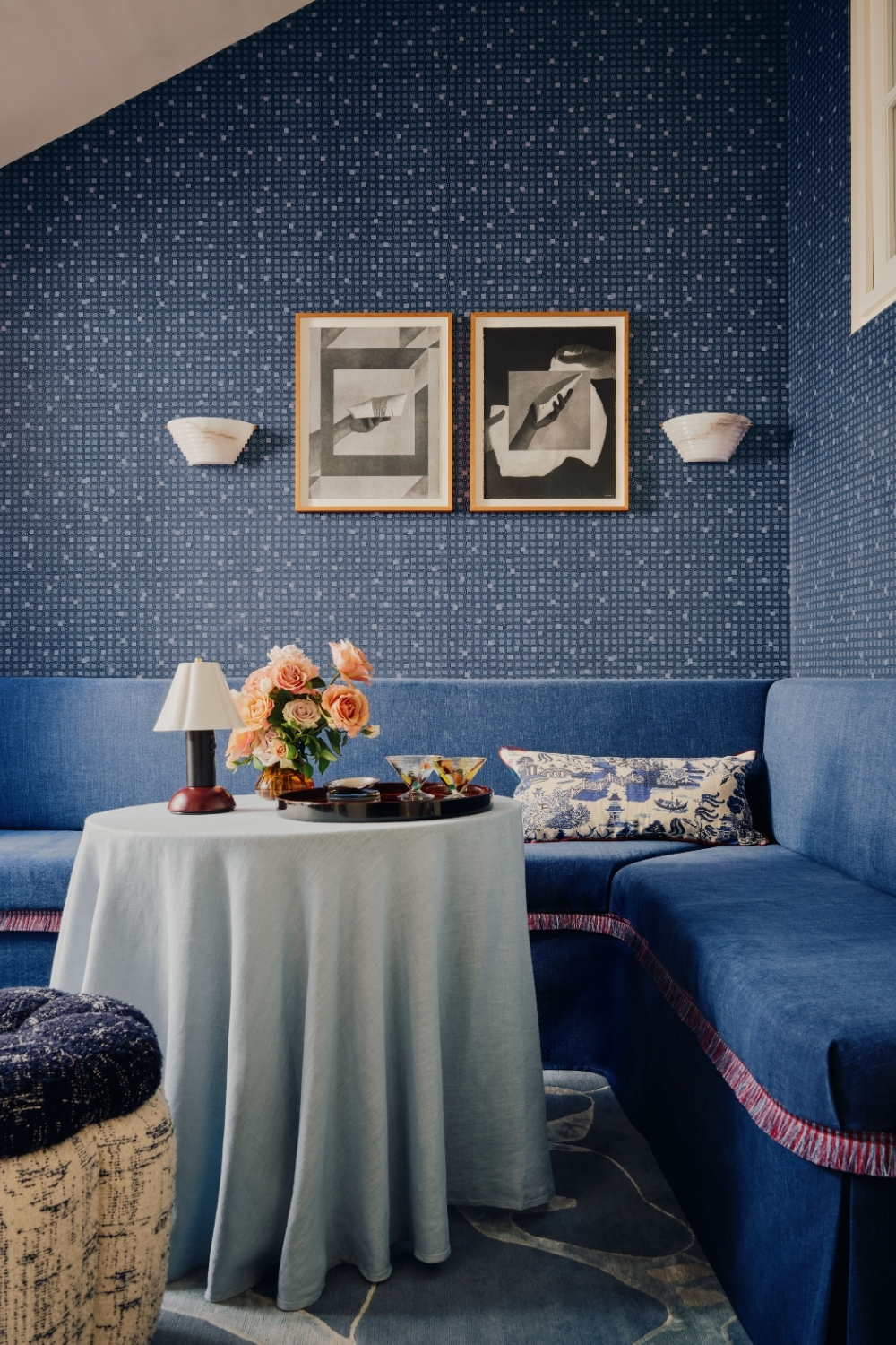
There can be a perception that Cole & Son is only about maximalist colour and pattern, but we’re so much more than that. Over 150 years, there have been so many different decorative and artistic styles, different design directors and technological developments. Formations is a way of reintroducing that richness, refining the original grids and patterns into patterns that feel grounded and new. Through etching, printing and over-printing, each design carries a familiarity which has been reimagined for today.
Cole & Son
One of the designs that really captures that is Wavelet. What inspired it?
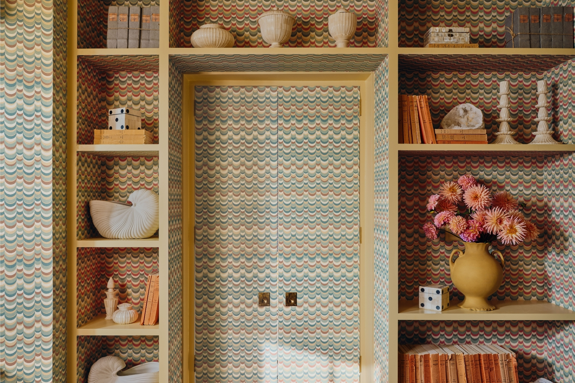
Wavelet began with an archival document featuring a single crescent shape. We loved its rhythm and the combination of geometry with a softer, curved quality. The original was hand printed, so it had a beautiful imperfection. We developed that into a layered, textile-like pattern, drawing on references such as flame stitch and bargello while retaining its distinctive 1950s character. We also wanted the colour palette to combine warm and cool tones, making it versatile enough to work within existing interiors.
Coles’ Colour Card is also taken from an old paint chart. Tell us more.
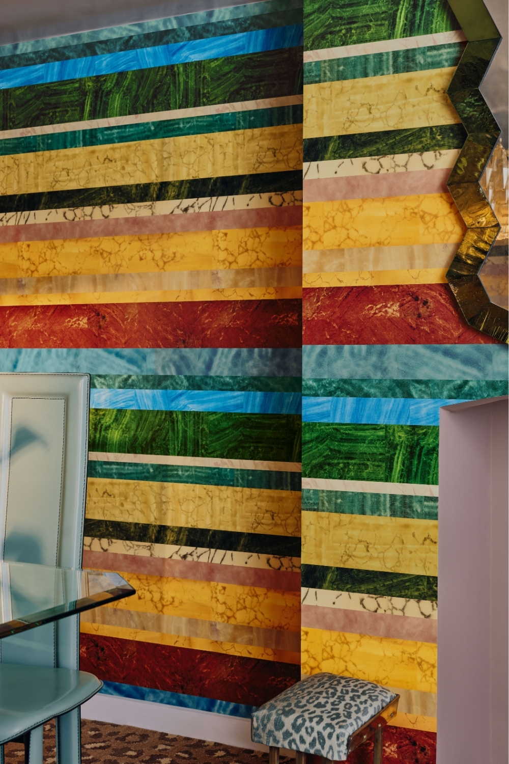
It was never intended as a wallpaper – it was one specific paint card which we loved, one of the many mid-century paint cards discovered in the archive. Again this was another important story for us. Cole & Son has done many other things such as making paint and hand-marbling, plus fabric-backed wallpapers in its long history. The colour card hues are bright and optimistic and the names are joyful: Tuscan Red, Mimosa, Lapis. It has an authenticity. We felt like it was a perfect opportunity to create a unique design that utilised our archive in an unexpected way.
Cole & Son
SHOP
You can browse the full Formations collection at cole-and-son.com