

Hue Are You: How Colour Affects Your Mood
By
3 years ago
One of the most important elements of design, colour is intrinsically linked to our psyche, affecting us both emotionally and psychologically. So, how does colour actually affect mood? Carole Annett investigates.
Does Colour Affect Your Mood?
Let’s Get Emotional
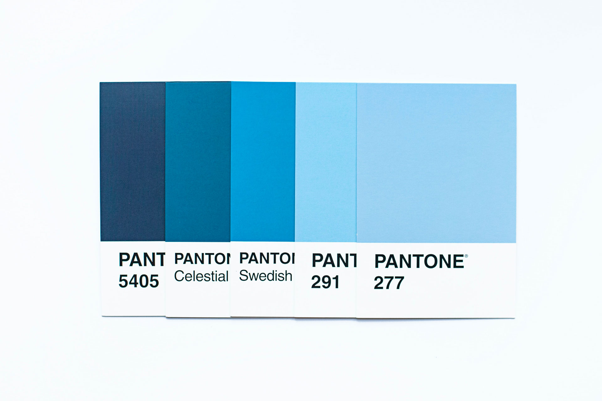
What’s your favourite colour? Let me guess… blue. Studies show it’s the most popular when people are asked to choose. Perhaps because it’s reminiscent of sea and sky, a lover’s eyes, a fond memory. As with music and fragrance, colour can affect our mood – it can elicit an emotional response in us and design companies are becoming increasingly aware of its power, often using colour experts, particularly in commercial spaces. But it’s complicated.
Stephen Westland is a professor of Colour Science and Technology at the University of Leeds. ‘There are a lot of myths associated with different hues when it comes to interiors,’ he says. ‘Blue traditionally has a calm connotation therefore often chosen for a bedroom, while orange and yellow are viewed as playful and invigorating, an uplifting shade for an eating area where you want appetite to be stimulated and conversation to flow.’ Big Mac anyone? Kit Kemp of Firmdale hotels says of red, ‘It lends itself very well to libraries and dining rooms where some “heat” is appropriate.’ She uses orange judiciously, ‘It’s not for everyone, but in small doses can lift a space.’ There have been many studies into the subject such as ‘does red really make your heart beat faster’ – a PHD thesis of 1950 suggests evidence that it does, minutely, in some people. But, ‘you need to add in individual variability,’ says Professor Westland, adding, ‘personally I love red. I hate blue.’
The Physical Effects Of Colour
So we know colour can affect our mood – but how about physically? Professor Westland explains: ‘Blue can be calming because of its association with the outdoors, but too much blue light, particularly at night, can have an alerting property, affecting deep sleep.’ Because our eyes respond to light, when we see colour it sends signals to the back of the brain, where vision takes place. Those sensors also send signals to a different part, the hypothalamus, an area in the middle which regulates temperature and sleep patterns, controlling the secretion of hormones. The professor again: ‘If you are in a room with walls painted blue, the most powerful effect will almost certainly be the emotional, psychological one. Is blue a good colour for bedrooms? Yes. But if you are looking at a bright blue light as on a screen, or smart phone which emits a lot of blue light, because of its intensity it’s likely to be stimulating. We need that bright light in the morning to keep the flow of our circadian rhythm, but not at bedtime where it has a contradictory effect.’
Blue can be calming
So, colour, and its intensity, is a powerful tool for affecting your mood – and always has been. As Henri Matisse (1869-1954) noted, ‘With colour one obtains an energy that seems to stem from witchcraft.’ Interior designer Sophie Robinson, known in her podcast, The Great Indoors, as ‘queen of colour’, wholeheartedly agrees. ‘Colour is intrinsic to how we feel in our homes and affects us on a deeply emotional level. It’s imperative you take the time to tap into which colours and tones really resonate with you, and then surround yourself with them. It may be invigorating brights and mellow neutrals. The key is not to be swayed by trends or experts but to follow your heart.’ Another study explored the emotional effect of three rooms, one with warm-coloured walls and furniture, one with cool and one with the same interior but no colour at all – achromatic. Participants rated the warm room higher for arousal and stimulating, while the cool room was rated higher for being spacious and restful. Both the warm and cool-colour rooms rated higher for happiness than the achromatic room suggesting that colour can lead to more positive emotional experiences. It has also been noted there are people who are more aware of their surroundings, known as ‘low screeners’ and those less affected by what a room looks like, ‘high screeners’, who block their surroundings out. Interior designers tend to be in the former category. Take Tricia Guild of Designers Guild, clearly a low screener: ‘In my opinion, living with the colours you love truly enhances our sense of vitality and well being. We make colour choices every day, almost subliminally, so the idea that colour is somehow scary or nerve-wracking is faintly ridiculous to me. I think in colour – I have colours for people and the days of the week – it’s an instinctive response I suppose and one that enriches my life and brings me so much joy.’
Choosing A Colour
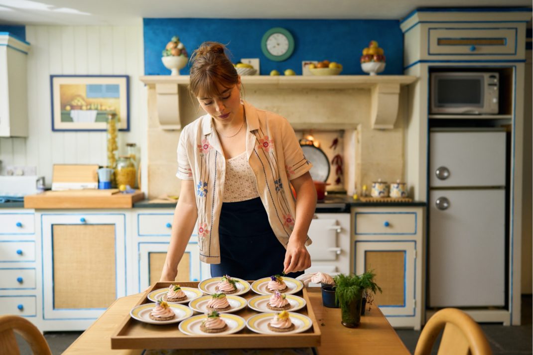
History shows we also turn to strong hues and their ability to bring happiness in times of stress. We are drawn to temporarily create extreme environments at transitional or highly emotional times such as divorce and death. After the Second World War people were desperate for an end to austerity and the drab interiors that dominated the time and in 1951 at the Great Exhibition, a British textile designer Tibor Reich created a hullabaloo when he exhibited ‘Westminster’, a lemon and deep mustard stripe. The fabric became part of a new ‘contemporary style’ celebrated with much fanfare by the media. When the world ground to a halt during Covid and we looked at our surroundings and found them wanting, paint companies reported an upsurge in sales with the DIY boom. As well as painting NHS rainbows, it seems people were also looking for a feel-good factor. Patrick Folkes, director of eco-paint company Graphenstone, comments, ‘Away from the neutrals, green was a big hit and has stayed in our top ten sellers along with pink’.
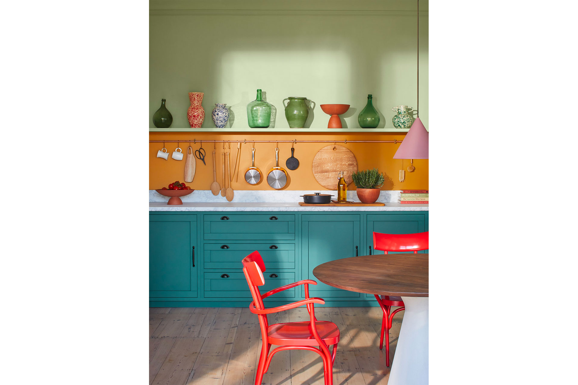
A colour kitchen, by Graphenstone
Pink’s popularity is noted in another white paper charting the rise of a rose tone nicknamed ‘millennial pink’, a key ingredient since 2016 that, like Harry Styles, seems to be gathering a stronger fanbase as it ages. It became ubiquitous in product packaging and clothing, a gender-neutral pink that embraced femininity and pushed the boundaries. Paint companies brought out numerous versions to feed the frenzy – Calamine by Farrow & Ball, Paper & Paint Library’s Temple and Little Greene’s Confetti all embrace the off-kilter blush. Couture brand Anna Mason became so involved with finding the right shade for its Westminster atelier that it resulted in a new shade: Mason Pink from Edward Bulmer.
There’s another factor too: judgment. As Professor Westland says: ‘If you asked a child what colour they wanted to paint a room they would say bright yellow and pink. Yet some people don’t want to paint their rooms in bright hues because they are worried about the resale value and being criticised by their peers, the “I wouldn’t do that” judgment of one’s personal taste.’ Of course, style-leaders don’t worry about judgment, they just do it – take Halston’s cherry-hued Olympic Tower office in New York faithfully reproduced by Netflix in the series starring Ewan McGregor; so much red it becomes a neutral.
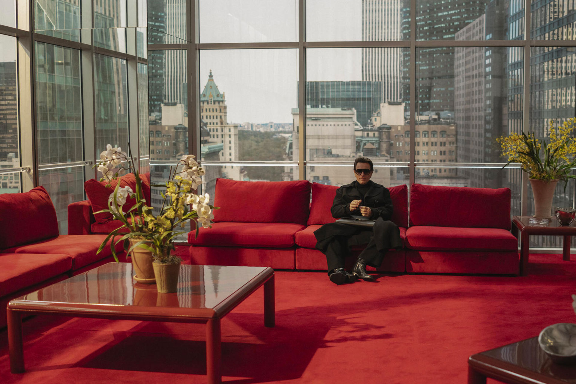
Halston’s office, courtesy of Netflix
Graphenstone’s colour consultant Betsy Smith offers an insight into current consumer taste. ‘Blue is increasingly replacing green as an alternative hue to satisfy our desire to remain connected to the natural world, partially driven by the popularity of wild swimming and the healing properties of water.’ So, we can conclude that colour can have a positive effect on our wellbeing and that designing a room taking into account both emotional and physical effects may create a happier home. I’ll leave the last word to the professor: ‘Colour can enhance performance and colour can affect creativity, whereas white walls were found to be boring and uninteresting. Hence a few years ago, there was a push to put art into hospitals because if you looked at a lot of our office buildings and hospitals, they have bland environments and I don’t think that is healthy for us. I don’t think colour is just fun, it’s important for our wellbeing and health.’
So can we assume Professor Westland’s home is decorated in red, his favourite colour? ‘When it comes to the home,’ he says, ‘colour choice also comes down to who is dominant in the decision-making. I’m married,’ he smiles, ‘so I’m only allowed one red wall.’ You can rest assured it makes him happy.