Who Gets To Decide The Colours Of The Year & How?
By
4 months ago
Plus a round-up of all the 2026 colours announced so far
It’s official: Pantone has declared Cloud Dancer its Colour of the Year for 2026, with many taking to the internet to decry the blandness of the off-white shade. If you’re not a fan, then never fear. Plenty of other brands have hopped on the bandwagon to reveal the colours and palettes they believe will encompass the coming annum. But who gets the power to choose the colour of the year? And, with infinite shades to choose from, how on Earth do they decide? We asked the experts how they do it.
How Do Brands Choose Their Colour Of The Year?
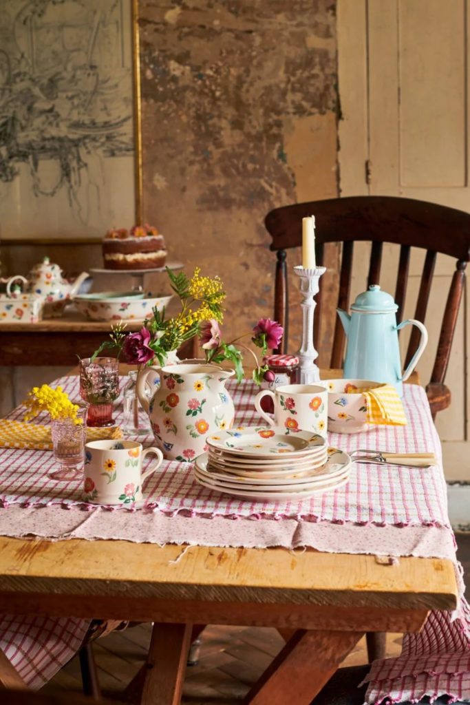
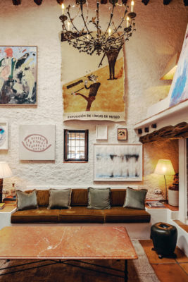
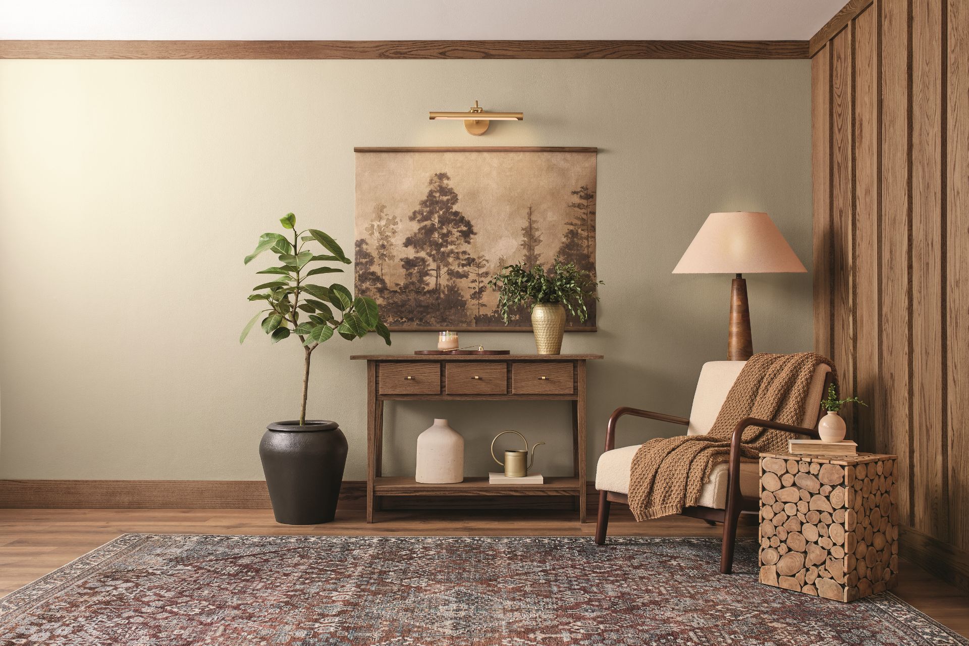
Apollo Blinds inspired by Dulux colour of the year
Who Gets To Choose?
Colour marketing manager Lisbeth Parada (who knew job titles could be so fun?) is in charge of choosing the colour of the year for Dutch Boy Paints, Minwax and Krylon. As a colour and design lead, she is thinking about colour ‘all the time!’ – ‘It’s second nature at this point. When I walk down the street, I’m looking at window displays; when I walk into a clothing or furniture store, I’m observing the colours and finishes the brands are manufacturing; or when I travel, I take inspiration from new sceneries and landscapes.’ Taking ‘tons of photos’, saving magazine clippings and collecting anything that sparks her imagination (whether it’s product packaging or a cool napkin) these real-world moments will often feed into her research for the next colour of the year, grounding her concept in something tangible and relatable.
How Do You Narrow Down The Colours?
Asking her how she does it, Parada explains that whilst most people assume the colour comes first, it’s actually the story: ‘I always begin by crafting a narrative, which becomes the foundation, and then, colour naturally follows.’ While one may assume that you would want to hold off picking the colour until close to the year at hand, the process can actually start up to 12 or even 18 months in advance. ‘I’m constantly tracking macro trends across design disciplines like interiors, fashion, architecture, and art to name a few,’ she explains, ‘and pairing that with insights into consumer behaviour.’ Avoiding fleeting microtrends, she instead analyses everything from social and sustainable factors to economic, political and technological movements to figure out what trends are defining our current zeitgeist.
Similar to Parada, the team at WGSN take two years to settle on the colours, while Lick take over a year. ‘We travel to trade shows across Europe, speak with experts and designers globally, and listen closely to what our community is gravitating towards,’ says Lick’s director of interior design Tash Bradley. ‘It’s actually really funny – we often start the year excited about one set of colours, and by the end we’ve landed somewhere completely different.’
Once Parada has mapped out the emotional and cultural landscape of the coming year, she will then use colour psychology to guide her towards a specific colour family. While the process may all sound a little wishy-washy, Parada is careful to include supporting data in her research, looking at sales figures to see which colors consumers are leaning towards. ‘Lastly, I consider overall trending colour families – what are those trending or up and coming colours and do they fit my narrative? From there, I narrow down the thousands of colours to a few hundred that align with my story and serve as a starting point. It’s a mix of intuition, research, and a lot of visual exploration.’
The Final Choice
But narrowing down to a few hundred can’t be much of a relief. With dozens of colours still left to pick from, does she ever struggle to land on a favourite? ‘Oh, absolutely,’ says Parada. ‘Choosing just one colour is the hardest part. After all the research and refinement, I usually end up with two or three strong contenders. I like to sit with them for a few days and let my ideas breathe a bit.’ Like any creative task, Parada finds that stepping away helps. ‘I’ll revisit my notes, talk it through with other trend forecasting colleagues to get their thoughts, and sometimes even dream about the colours!’ Eventually, she will find that one feels just right. ‘I try to make the final decision on a day when I’m feeling clear-headed and confident – usually in the morning, with a fresh cup of coffee. Once it’s chosen, I commit.’
Minwax
At WGSN, the process sounds even more intense, running Global Colour Workshops in which the brand forecasts the 50 colours which will define the upcoming season. ‘Our selection process is very precise,’ says senior colour strategist Clare Smith, ‘and we debate our research and the colours over three days to choose the final shades which will make up the Global Colour Palette and then the Key Colours and Colour of the Year. The consensus on colour must serve all our industries from fashion, interiors, beauty, sport & outdoor, and consumer tech.’
For Lick, however, the process seems more instinctual. Bradley explains that she’s always thinking about how the chosen colours will influence the way people feel in their homes. ‘Colour is incredibly emotional, so I want to make sure that every shade we curate feels not only inspiring but also accessible and timeless.’ For Bradley, it’s about curating the noise: ‘We see so many tones and influences emerging globally – from trade shows to the high street to homeware and fashion – and my role is to distill that down into an edit that makes sense for people’s everyday lives.’ While you of course need to consider the colours defining the current moment, Bradley also wants to give people confidence that they’ve chosen shades that will stand the test of time. ‘It’s not just about what’s trending now. The palette has to feel easy to live with, versatile across different rooms, and adaptable to personal style — so that people can truly make their homes feel their own.’
How Do You Predict The Future?
While it’s all well and good figuring out what colours people are obsessing over this year, with the ever-quickening speed of the trend cycle, the task of working out what colours will be defining us in a year’s time seems like an almost impossible feat. ‘Some cultural moments are easy to anticipate like major sporting events, global summits, technological launches, or big film releases,’ says Parada. However, much like weather forecasting, Parada explains that sometimes you simply have to do the best with the information you have: ‘You stay flexible (do I bring my umbrella with me or not?). The goal is to reflect the spirit of the time, not control it.’
Once she’s landed on her primary colour family, that’s when Parada starts to dive into the details (undertones, saturation, value and temperature) and begins to build the supporting visuals. ‘I always fall more in love with the choice. It is difficult to share it out internally and externally because I can’t help but wonder, “will others also like it?”, but if I take the time to create that foundational narrative – those “why’s” behind my selection – I find that most people, even if it’s not their favourite colour, can appreciate it as well.’
Dutch Boy Paints
But with so many different brands announcing so many different colours of the year, the oversaturation of the concept, makes the importance of the colours feel somewhat diluted. Parada herself is not only choosing one colour of the year, but three, for three different brands. ‘Each brand has its own voice, audience, and application – context is everything,’ she says. ‘A bold, trend-forward colour might work beautifully for paint or aerosol, but not necessarily for wood stain, which tends to lean more classic and natural.’ According to Parada, there is no such thing as an ‘ugly’ colour – it’s all about how and where it’s used. ‘A colour might not look good on a car for example, but might be the next “it” colour for electronics, fashion or paint, etc. I also consider brand values, regional preferences, and product-specific trends.’
While Parada has the hard task of selecting one specific colour of the year, at Lick the brand rather curates an edit of eight colours. As Bradley explains, ‘When it comes to narrowing down colours, our approach as a brand is a little different. We don’t believe in selecting just one “Colour of the Year”, because colour is never experienced in isolation.’ By choosing a palette, Smith explains that this gives people the freedom to create a scheme that feels whole-home ready, while still reflecting the cultural mood of the moment.
The 2026 Colours Of The Year Announced So Far
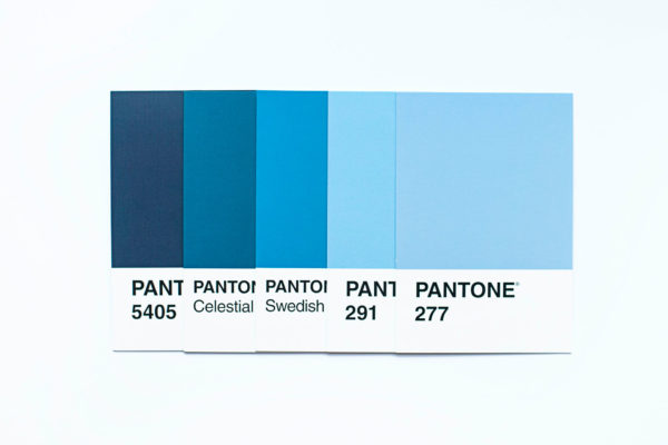
Pantone
While many predicted shades of green and blue, Pantone took everybody by surprise with Cloud Dancer: an ethereal off-white shade set to provide a blank slate and calming presence to our hectic online lives.
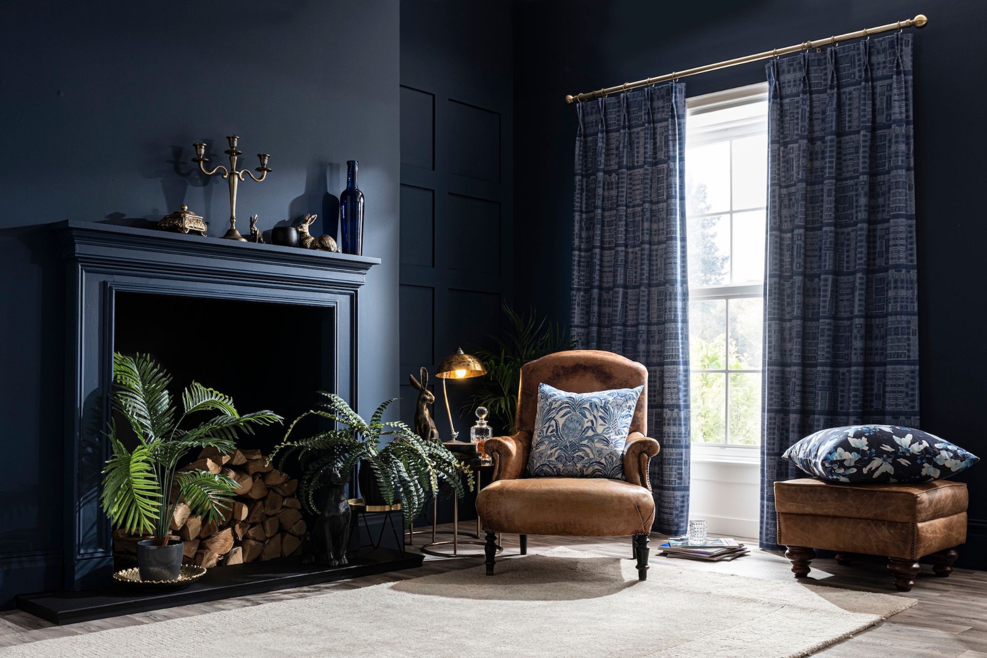
Dulux
Rather than announcing one singular colour, this year paint brand Dulux announced a mini palette, dubbed The Rhythm of Blues. The trio of indigo shades are designed to bring balance, calm and creativity into the home. The three shades include Mellow Flow (a light and airy blue), Free Groove (a vibrant indigo) and Slow Swing (a deep and grounding blue).
Valspar
For Valspar, 2026’s colour of the year is Warm Eucalyptus. Designed to give you a warm feeling inside, the colour is described as ‘naturally restorative and serene’. Chosen to represent mindful living, it mirrors the trend of slowing down time. Blurring the indoors and the out, the brand recommends styling the shade with ceramics and organic pieces.
WGSN x Coloro
Announced all the way back in 2024 (with the 2027 colour of the year and 2028 autumn/winter palette already announced) WGSN and Coloro’s colour of the year is Transformative Teal. A deep, cooling blue-green shade, it was chosen to symbolise nature’s diversity and promote an Earth-first mindset, reflecting themes of change, renewal and resilience in the face of climate challenges.
Lick
Entitled Return To Play, Lick’s colour palette for 2026 is all about nostalgic primary colours reimagined with a grown-up, refined feel. Featuring rejuvenating greens and warming neutrals, the palette champions timeless emotional resonance over fleeting trends. Joyful yet considered, the colours have been curated to encourage unexpected colour palettes and unapologetic design that feels inherently ‘you’.
Glidden
Protesting against the millenial greys that dominated the 2010s, Glidden has landed on Warm Mahogany as their 2026 colour: a rich and grounded burnt red. As paint colour expert Ashley McCollum, explains, it is ‘bold enough to draw immediate attention and reserved enough to make a timeless statement’.
Minwax
A warm, earthy brown stain designed to highlight the natural beauty of wood, Special Walnut was chosen for its timelessness. ‘There isn’t a need to replace it with next year’s it color,’ explains Parada. ‘It is time-tested, enhances the wood’s natural grain and fosters a deeper connection with the home.’
Krylon
For its colour of the year, Krylon settled on Coffee Bean. Embracing the beauty of nature, this colour is described as creating a calming and contemplative sanctuary and bringing timeless luxury and modern sophistication to everything it touches.
Behr
Designed around its primary colour Hidden Gem (‘a smoky jade with an air of mystery and sophistication’), Behr’s palette for 2026 includes warm neutrals, vibrant accents, soft pastels and cool mid-tones.
Dutch Boy Paints
Creamy and warm, Melodious Ivory is Dutch Boy Paints’ colour of 2026. Chosen for its nostalgic yet elevated vibe, this timeless shade is perfect for showcasing handmade pieces and bold layers.
Benjamin Moore
Paint brand Benjamin Moore opted for a luxurious charcoal named Silhouette. Moving away from grey’s dark and gloomy reputation, the espresso brown understones keep the shade feeling earthy and inviting.
Sherwin Williams
Another more neutral shade for colour of the year, Universal Khaki is a liveable neutral sitting somewhere between beige and taupe.
Graham & Brown
A gorgeous oxblood red, Divine Damson is perfect for those who love a moody jewel tone. The colour was chosen for its timelessness and versatility, as well as its sense of elegance, luxury and sophistication.
C2
Named after a rustic French village, Epernay mirrors its architecture with its champagne-inspired hue and warm yellow undertones. ‘This historic hue helps us retell the wondrous stories woven through history via the inseparable threads of color, art, furnishings, and nature,’ says the C2 team. ‘It reminds us to appreciate the personal touches that make a home uniquely ours – and to live with reverence for the stories we’re creating every day.’
Etsy
Alongside Etsy’s 2026 colour of the year – a gorgeous Patina Blue – Etsy have announced their first ever texture of the year, washed linen. Inspired by copper’s natural ageing process, Patina Blue was chosen to embody the quiet magic of change, reflecting a growing appreciation for pieces that wear in, not out. Meanwhile, washed linen was chosen as an antidote the years of hyper-polished, ultra-curated interiors, representing the current appetite for comfort, softness, quiet luxury and textures with natural variation.