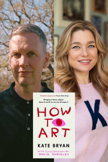
How To Choose A Frame For Art, According To Soho House’s Chief Art Director
By
6 months ago
Kate Bryan shares her frame game
Next week, Soho House’s Chief Art Director Kate Bryan and award-winning British artist David Shrigley‘s new book How To Art will hit the shelves (18 Sept, pre-order it here). And a couple of days later, both will take to the stage at Cadogan Hall to delve into their new publication and all things demystifying the art world, as part of the inaugural Chelsea Arts Festival (get your ticket here). Because that’s at the core of this project: ‘How To Art is a complete demystification,’ Bryan told C&TH earlier this year. ‘It’s supposed to be funny and a bit irreverent – but a love letter to art, too. I love art, and I want everyone to come to it. But I don’t want everyone to feel like it’s too elitist and snobby for them.’
Here’s an extract from How To Art ahead of publication day, tackling the perennial issue art collectors new and seasoned face: which frame should I choose?
Kate Bryan’s Guide To Framing Art
I want to demystify framing. Learning which art you love and managing to buy some is a huge win, and the framing of it shouldn’t be a buzz kill.
I remember the first time I went into a framing shop. It was in Hong Kong, and I had to brief the framer on what the gallery wanted for an upcoming exhibition of work by Sir Peter Blake. I was sent because I had previously worked at the British Museum, had an undergraduate degree in art history, and was about to receive my postgraduate degree. So, naturally my boss thought I was well equipped for what she saw as an ordinary gallery task. She was wrong. I felt overwhelmed by the choice and terminology. So I know how it feels to have framing malaise.
Twenty years later, I have framed thousands of artworks as an art dealer and curator for large collections, and I have also picked them out for myself. Here’s the inside track on how to make the frame the icing on the cake – as opposed to the reason no one eats the cake.
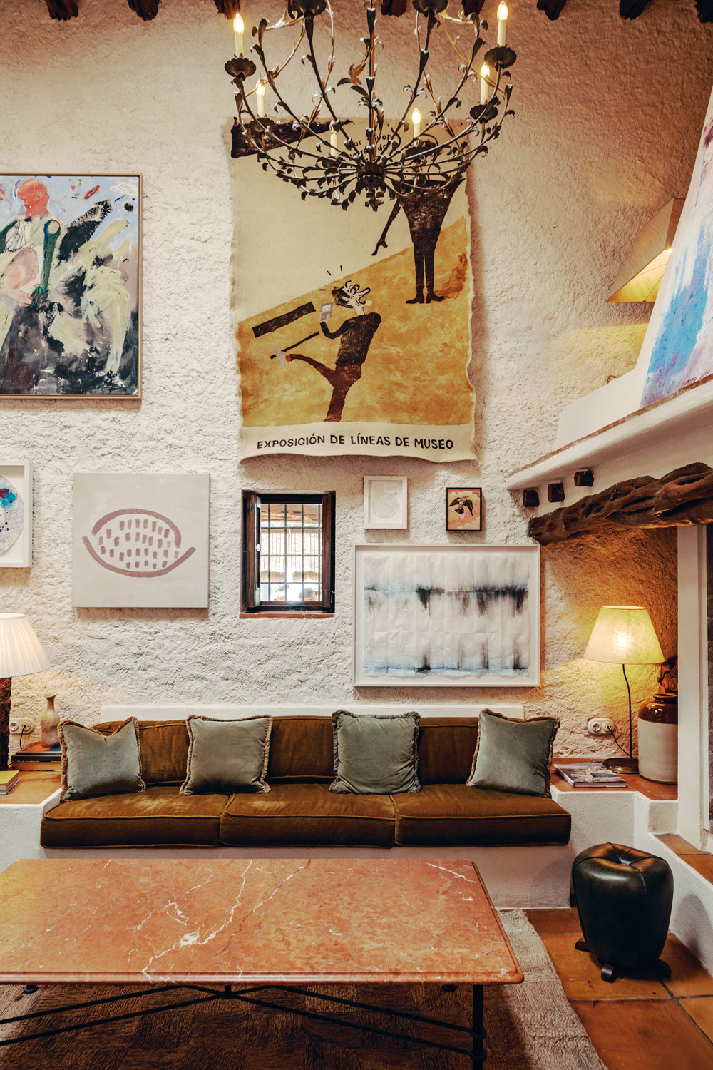
The general consensus is that the frame should be in sympathy with the artwork and not distract from it or undermine it in any way. The Peter Blake works in Hong Kong were pop art prints, mostly large in size so they needed mounts – to hold the work steady and create a visual interlude between the artwork and the frame. An alternative is to ‘float’ the paper. This is a more contemporary solution and works well with smaller artworks – larger pieces are often too heavy to float.
The more creative decisions are to be made when choosing the frame. I much prefer frames that have an exposed wood grain, as they feel more natural and softer. For the same reason, whenever possible, I avoid black frames – I find them so heavy and ‘final’, and prefer the feeling of the eye flowing across a space with various artworks that look as if there is an open-ended conversation between them.
An amusing example of how framing is an indicator of the taste of the owner was an exhibition at the Tate Modern of the photography collection of Sir Elton John and David Furnish. Before the visitor entered the exhibition, there was the usual wall text to set the stage for the show, at the end of which was what I can only describe as a disclaimer to convey that ‘the photography is being exhibited in the collectors’ frames’. Having been round the exhibition, to my mind it was as if the Tate needed to make it clear that they had not chosen the leopard-print or ornate gold frames for modern photography. They might not have been neutral, but I loved the frames. The couple had assembled an incredibly strong collection over decades and were generous enough to share it with the public, and I felt that their occasionally flamboyant attitude to framing was an extension of the passion of the whole enterprise – as if they had welcomed these artworks into their family and dressed them in keeping with the gang.
How To Art: Finding Joy & Making Sense Of It All, With Kate Bryan & David Shrigley
From 1.30pm, Saturday 20 September 2025 at Cadogan Hall. Tickets start from £12.50pp.