It’s Official: Blue Is The Colour Of The Summer
By
9 months ago
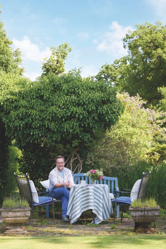
We’ve got a case of the summer blues…
Sorbet shades may have swept across the interior design world in spring, but it looks like blue hues are set to take their place. Here’s everything you need to know about the latest summer colour trend of 2025.
Summer Colour Trends 2025: Blue Hues

Blueberry
After strawberry matcha interiors made such a splash, it’s no surprise that a penchant for blueberry has begun to emerge – and in contrast to the soft pastels of many spring trends, this particular colour makes a much more vibrant addition to any space.
‘A bold reinterpretation of classic blue, blueberry is a rich, contemporary shade that strikes the perfect balance between playful and luxurious,’ says Mark Holloway, interiors expert and founder of Holloways of Ludlow.
Yet it’s not as lurid as you might think: ‘Reminiscent of sun-ripened berries, this shade carries a subtle violet undertone, bringing with it a cool sense of sophistication,’ Mark notes.
In fact, the purple undertones mean that blueberry shades pair perfectly with pastels like lavender and sage – or deeper purples like plum and amethyst, if you feel like making a statement.
‘We’re seeing an ever-increasing shift in the design world towards tones that evoke a fresh, modern feel,’ Mark reflects. ‘Blueberry and lavender fit right into this palette, offering a juicy alternative to earthy greens, pastels and neutrals.’
So, what’s the best way to style blueberry interiors? ‘Pair the shade with warm woods or woven jute to soften its vibrancy,’ Marks recommends. ‘Layer with similar tones such as lavender, french navy and periwinkle to create a rich effect; or, for a contemporary look, set blueberry against crisp white walls or soft greys, and add brushed brass fixtures to inject colour into an otherwise neutral palette.’

Cornflower
Don’t fancy something quite as juicy as blueberry? Cornflower is the summer colour trend to have on your radar.
‘Cornflower blue offers a beautiful blend of serenity and cheerfulness; it’s a shade that manages to uplift without being overpowering,’ explains Lena Gierasinska, head of product & displays at Barker and Stonehouse. ‘Its brightness introduces gentle energy into a room, while its soft undertones maintain a calm, composed atmosphere.’
Whether you’re after a light and airy kitchen colour or a restful bedroom hue, cornflower is versatile enough to suit any space. ‘In rooms with limited natural light, cornflower blue can take on a slightly greyer, duskier character, which adds a sense of intimacy and depth,’ says Shelley Cochrane, accessories buyer at Furniture Village. ‘Conversely, when bathed in daylight or illuminated by warm-toned artificial lighting, the colour reveals a clarity that can instantly lift the mood of a space, making it feel open, serene, and full of life.’
A classic pairing with cornflower blue is, of course, a neutral palette. ‘When paired with crisp whites and soft greys, this shade creates a refined aesthetic that feels timeless,’ Shelley states. For a more dramatic effect, however, go for deeper tones. ‘Surprisingly, cornflower blue also harmonises exceptionally well with warmer shades like terracotta, ochre, or muted mustard,’ she reveals. ‘These richer hues bring depth and warmth, evoking a relaxed, Mediterranean-inspired ambience that’s sun-baked yet breezy.’
And when it comes to textures and finishes? ‘Think handwoven rattan, tactile linen, pale oak flooring, or even lightly whitewashed brick,’ Shelley suggests. ‘These organic elements provide an effortless contrast to the cool quality of cornflower blue.’

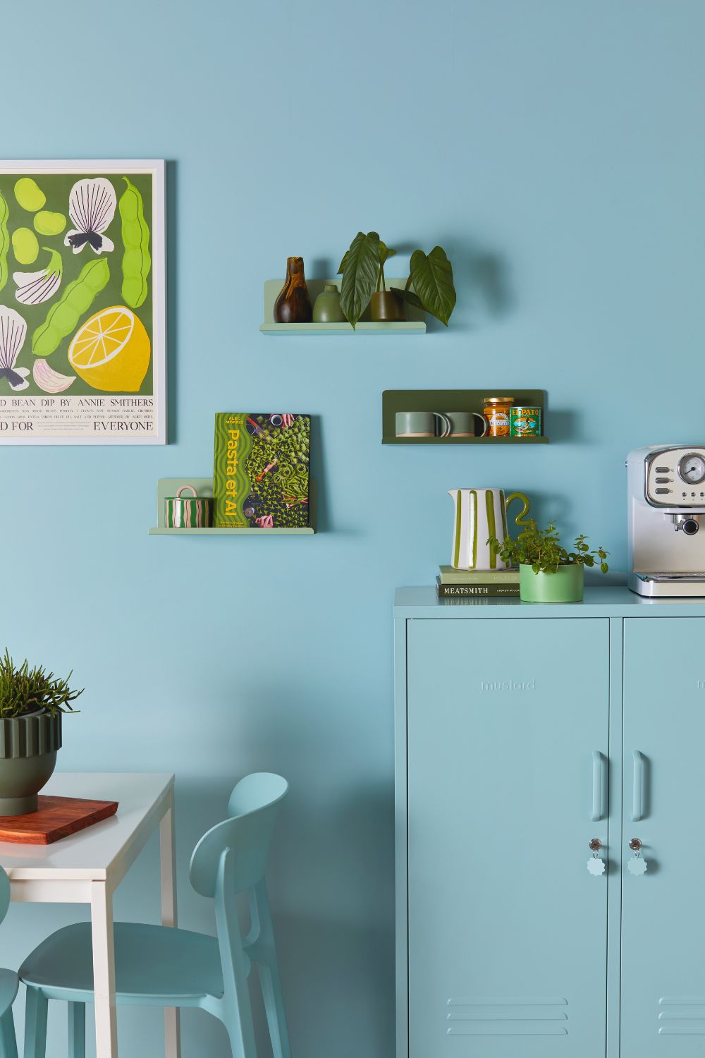
Powder Blue
If you’re after a peaceful, minimalist look, retreat even further into pastel territory with hints of powder blue.
‘Homeowners are seeking tranquility in their spaces, especially in times of uncertainty, and powder blue echoes this desire for a calming atmosphere,’ asserts Mohammed Bharucha, founder of Doorfinder.
According to Mohammed, powder blue is a particular popular choice for kitchens. ‘It reflects light beautifully and makes smaller kitchens feel larger, bringing a touch of elegance without overwhelming the space,’ he tells us. It works well on lower kitchen units, with white or cream upper cabinets. ‘This creates a striking visual contrast while still maintaining the soft, calming effect of the colour,’ he explains.
While powder blue kitchens are perfectly suited to brass or even matte black finishes, bedrooms can provide a different kind of backdrop for this soothing shade. ‘It pairs effortlessly with natural textures like linen, cotton, and light wood,’ says Lena, ‘while accents in burnt orange or terracotta – introduced using cushions, artwork, or a statement chair – add a punch of colour, creating a sophisticated palette that’s full of character.’
Featured image courtesy of Mustard Made. mustardmade.com