Why 2026 Is The Year For 2016 Interiors
By
2 months ago
A decade’s worth of nostalgia is the latest home trend
Do you remember what you were doing in 2016? Maybe you were curating a particularly aesthetic breakfast bowl for Instagram, listening to Zara Larsson’s latest chart-topping hit or worrying about the Trump administration. (Some things never change.) But if you happened to be tackling a home transformation, you’ll likely remember stocking your Pinterest board with rattan baskets, rose gold mirrors, marble counters and pink sofas. Call it nostalgia, call it timeless design – but 2016 interiors are, once again, having a moment. Ten years later, to be precise.
2016 Interiors Are Coming Home
The internet is never one to shy away from serotonin-inducing nostalgia – so when 2016 became a hot topic of conversation earlier this year, it quickly became a viral movement. And while some people might focus on fashion or music, others (aka, us) were looking at how the year was defined in terms of home design.
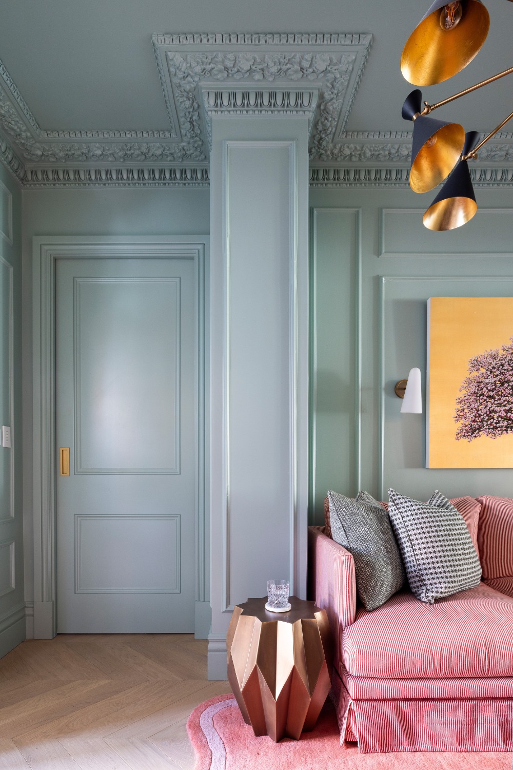
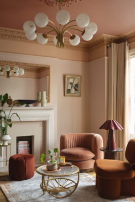
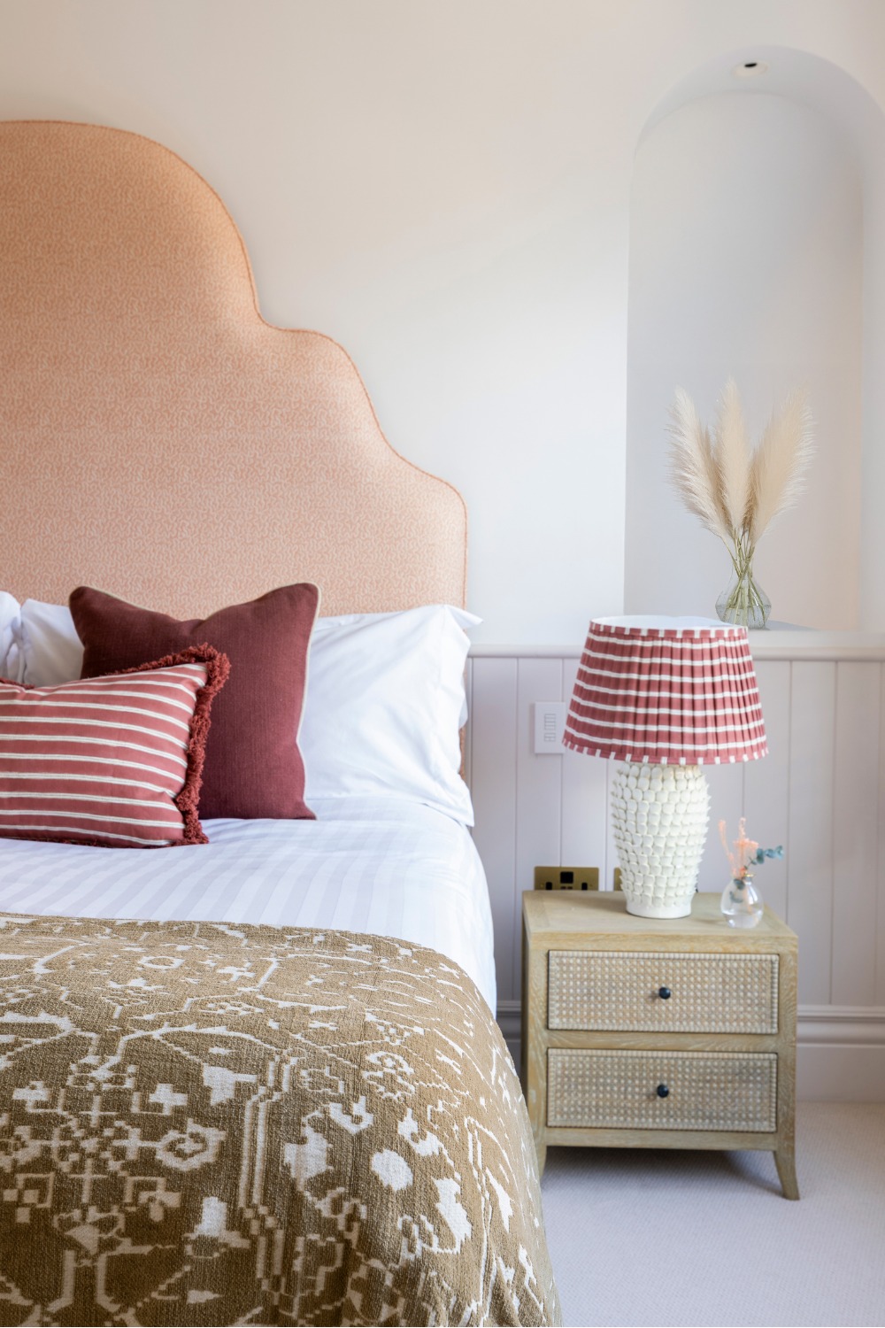
Project London
The year was defined by two broad, yet polar opposite, design approaches: minimalism and maximalism.
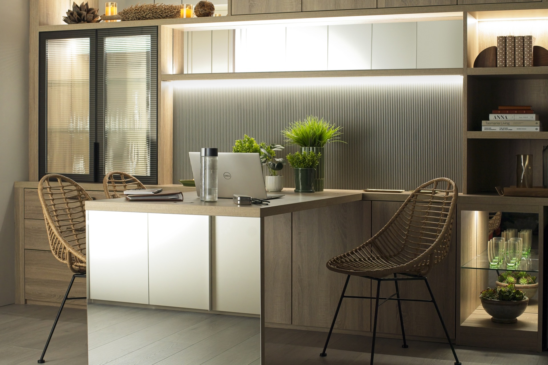
Defined by cool neutrals (think grey, beige and, of course, greige), Scandi design and warm wood tones, 2016 minimalism was less about a ‘stripped back’ look and more careful curation. ‘It was a period that favoured minimalism and a more restrained, cooler aesthetic,’ confirms Philipp Nagel, Director at Neatsmith. ‘Grey was the dominant neutral, while dark woods such as walnut and brown oak were widely used in finishes and fitted furniture throughout bedrooms, dressing rooms and home offices.’
He adds that the look wasn’t so much about trends, but timeless fixtures that would last for years to come. (And, if articles like this one are anything to go by, it seems that wish came true for many design enthusiasts). ‘There’s a growing appreciation for interiors that feel timeless rather than trend-led, and many of the materials popular in 2016 naturally lend themselves to that longevity,’ adds Philipp. ‘People are rediscovering the appeal of simplicity, quality materials and the reassurance of well-considered design. Homeowners want spaces with character and soul, something achieved through thoughtful design choices rather than constantly chasing the latest trend. It’s about investing in homes that feel personal and built to last.’
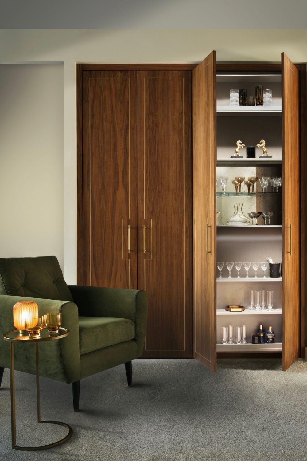
Neatsmith
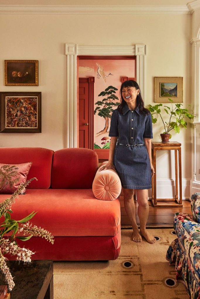
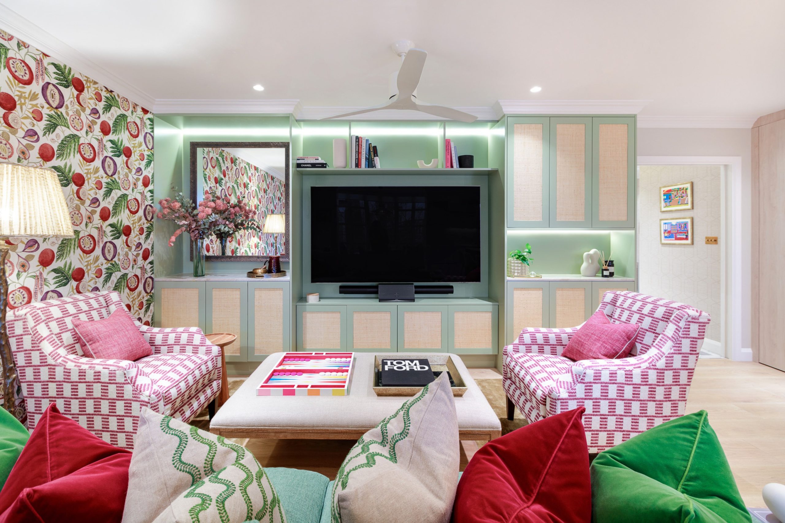
On the other end of the spectrum, meanwhile, sits 2016 maximalism. The flashier version – and the one you most likely remember – is perhaps best known by some of its more ‘out there’ trends: colour saturation, curved sofas, disco balls and all things rose gold. ‘Interiors in 2016 were defined by an expressive approach,’ notes Marcelina Janiszewska, Head of Design at Project London.
She adds that most interiors had a Bohemian feel, featuring bold colours, leafy plants, woven textures and over-the-top accessories. ‘Warm, earthy shades like rust and beige were paired with rattan furniture and macramé details to add texture and comfort, while jewel tones brought depth and contrast, often used on feature walls,’ the designer tells us. ‘Metallic finishes, especially rose gold, appeared in lighting, bathroom fittings, and accessories. Homeowners confidently combined colours, textures, and patterns: animal prints, statement wallpapers, and metallic accents were embraced without hesitation.
‘Maximalism was celebrated, and the online world encouraged experimentation, proving that playful choices, like pinks in interiors or fashion, could be taken seriously,’ she continues. ‘This particular brand of 2016 is making a comeback because people are craving interiors that feel personal, expressive, and unapologetically playful after 2025’s era of warm minimalism and neutral palettes. Maximalism feels fresh again, offering freedom to mix styles and patterns. It’s a reminder that homes can be both stylish and joyful, reflecting personality rather than following strict rules.’
Project London
So whether you’re team maximalist or minimalist, we’re sure there’s room for a slice of 2016 in your current interiors setup. Not sure where to start? Our experts are here to help:
Expert Tips For Getting The Look
Pick A Colour Palette
Most design projects start with a colour palette – and when it comes to 2016, you can go down two routes: bright and bold, or calm and neutral.
For the former, think pretty pastel blues and sugary pinks (Pantone’s 2016 Colour of the Year, to put it into perspective, was rose gold), or even more vibrant shades of sunny yellow and seasonless jewel tones. At home, Marcelina emphasises that these colours should be used boldly. ‘Instead of limiting them to a feature wall, consider extending them to walls, ceilings, and joinery,’ she recommends. ‘Colour-drenching is a continuing key 2026 trend and adds drama and cohesion.’
And for the minimalists among us, Philipp suggests a grey-toned palette. But to avoid the space getting lost in the neutral void, he says to avoid leaning too heavily into cool tones without contrast. When a space becomes grey-on-grey, it can quickly feel flat and cold.’ To get the right balance, he suggests pairing ‘cooler colours with warmer materials such as darker woods, layered textures and thoughtful lighting’ to achieve a look that ‘still feels comfortable and inviting.’
Build Structure
While trends certainly played a part in 2016 mood boards, they were often bookended by more timeless design notes – warm finishes, textured surfaces, greenery-filled spaces – as well as structured spaces that were made to last.
‘The 2016 look relied heavily on structure, often translated into fitted furniture and architectural joinery – whether that’s wardrobes, shelving or a dedicated home office,’ says Philipp. He adds that these elements didn’t feel flat or undecorated, but bonded practicality and style by bringing in textural details. ‘Fabric inlays, fluted elements or layered finishes add depth and warmth, ensuring the space feels intentional rather than stark.’
Neatsmith
Be Playful
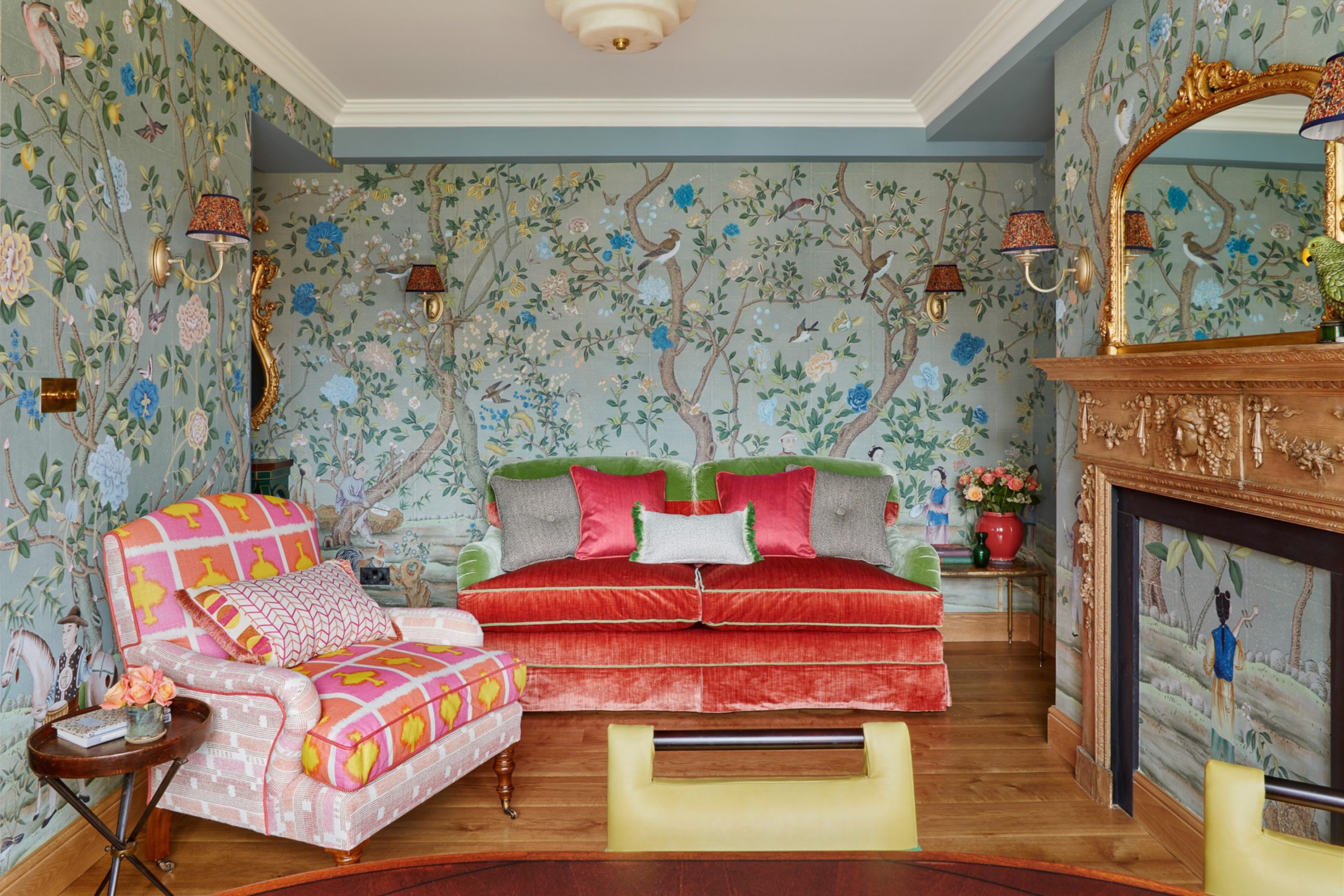
If we had to sum up 2016’s look in one word, it would be eclectic. While matchy-matchy design certainly did have a place (especially in spaces where minimalism thrived), the year was perhaps best known for its cluttered concoction of visual references – a blend of Scandi chic, Millennial pink, biophilic design and Bohemian decorations. It shouldn’t have worked, but the personality this jumble gave a home made sure it did.
Nailing this perfect balance of chaos comes down to ‘mixing textures and styles, rather than aiming for one cohesive look,’ confirms Marcelina. ‘Pair rattan furniture with classic pieces, contemporary lighting, and even reimagined animal prints – for example, a bold patterned headboard can work beautifully in an otherwise pared-back room.’
Don’t Get Distracted By Trends
Trends are fun, don’t get us wrong, but don’t let them lead all if your choices. ‘Don’t follow trends too literally,’ echoes Marcelina, ‘While these spaces felt layered and vibrant, some leaned heavily into trends, which occasionally limited their long-term appeal.
‘Instead, pick elements you love and combine them to create a scheme that feels unique and personal,’ she adds. ‘Playful choices like pink were a hallmark of 2016, but you don’t need to recreate a pink-saturated space today, that particular look belongs to the past.’
Project London
Show Your Personality
‘The 2016 trend reminds us that interiors can be playful, layered, and full of personality,’ emphasises Marcelina. ‘The key takeaway for today is to embrace individuality: mix textures, styles, and colours in a way that feels authentic to your home. By taking inspiration from the spirit of 2016 rather than copying it exactly, you can create spaces that are vibrant, comfortable, and timelessly expressive.’
And yes, there’s also room for characterful design in more minimalist settings. ‘What’s interesting about the return of this look is that it’s being refined rather than replicated,’ notes Philipp. ‘The 2026 interpretation of 2016 interiors moves away from strict minimalism towards a more layered approach, using familiar materials in a more tactile way, while allowing personality to come through and avoiding a generic finish.’