London installs a Climate Clock to Mark IPCC Report
By
4 years ago
It's a universal symbol for urgency
The first of its kind for London: a new clock counts down how much time is left to stop global warming rising above 1.5°C. Installed at The Design Museum, the clock marks the latest IPCC report that’s out today. But here’s why it’s not all bad news.
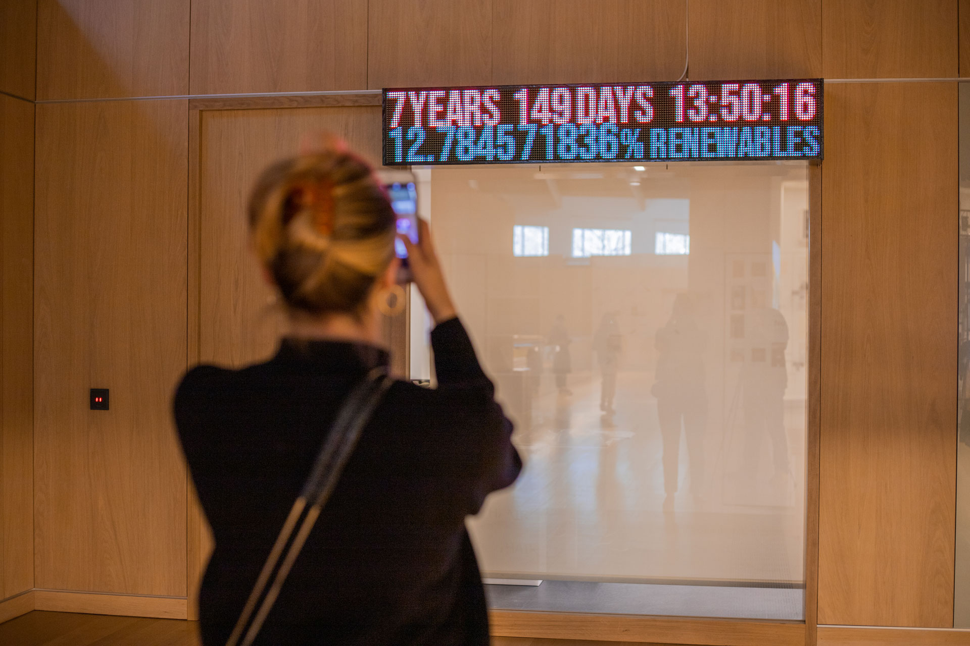
London’s Climate Clock Counts How Much Time We Have Left
London’s First Climate Clock at the Design Museum © Harry East
What’s in the IPCC report?
You may have heard of the IPCC report, but what actually is it? These reports are created by a body from the United Nations called the International Panel on Climate Change (IPCC), which makes scientific assessments of climate change for policymakers.
The report, released on Monday, is a comprehensive assessment of the climate, based on 34,000 studies and approved by 195 countries. The good news is that a liveable future remains in grasp, but we have a short window of time that’s ‘brief and rapidly closing’.
But the study finds that now 40% of people globally are ‘highly vulnerable’ to the climate, showing that extreme weather events like floods and heatwaves are affecting people in ways more than previously understood. And it’s not just an environmental fight, the report sees poverty and inequality suffered by millions of people as inseparable from the problem. There’s much more to learn, you can read the full report here.
The Climate Clock: A Breakdown
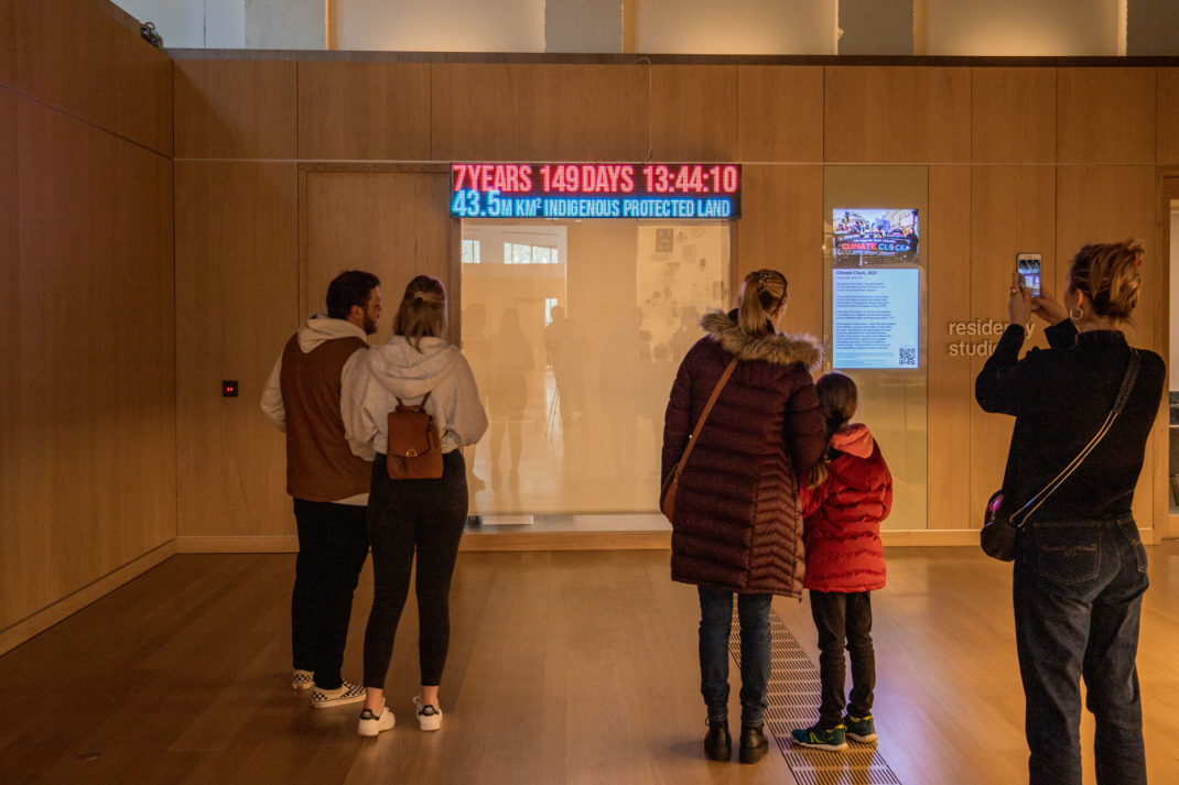
So why a clock? It’s the universal symbol of urgency. A clock has no way of weaselling out of the truth; it lays out our uncomfortable reality bare in illuminated digits, incentivising action. So in red is the time left before we hit the global temperature of 1.5°C. This is the temperature that’s held by the IPCC as the critical point before we are able to hold off the more adverse impacts of climate change. Before then, we need to reach zero emissions.
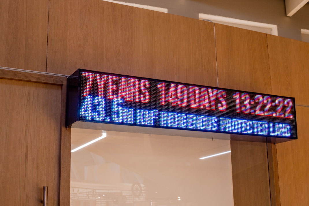
Not all doom: The amount of Indigenous land that is protected is celebrated © Harry East
But before you sink your head in the sand: in blue underneath, we have stories of hope. It displays our three ‘lifelines’ (in other words: how we’re going to get out of this), displaying the amount of land currently protected by Indigenous peoples, what percentage of the world’s energy supply comes from renewable sources, and the amount of money dedicated to the Green Climate Fund.
There’s also the other compelling reason to install a climate clock: it’s easy to understand. When there’s a wealth of data, numbers, reports that can often alienate and intimidate an audience, a neat visualisation can do the trick. That’s what Justin McGuirk, Chief Curator of the Design Museum says, as the clock works a ‘vital piece of communication design that turns complex environmental data into a clear message.’
Similar iterations of the climate clock have been seen, like at Glasgow’s COP26, where the clock was mounted on top of a hybrid electric car that took to the streets to spread the word that the world must #ActInTime. It was famously seen in 2020 too at Union Square in New York, where a climate clock installation went viral.
View this post on Instagram
The installation was made in collaboration with Future Observatory, a research programme coordinated by the Design Museum and the Arts and Humanities Research Council supporting the UK’s response to the climate crisis. You’ll find the clock on the second floor of The Design Museum, based in Kensington in London. Catch the Climate Clock’s updates on their Instagram.
SEE MORE