

Inside Patrick O’Donnell’s Wonderfully Vivid Worcestershire Home
By
3 months ago
A new design tome on layered interiors spotlights Patrick O’Donnell’s beautiful decor
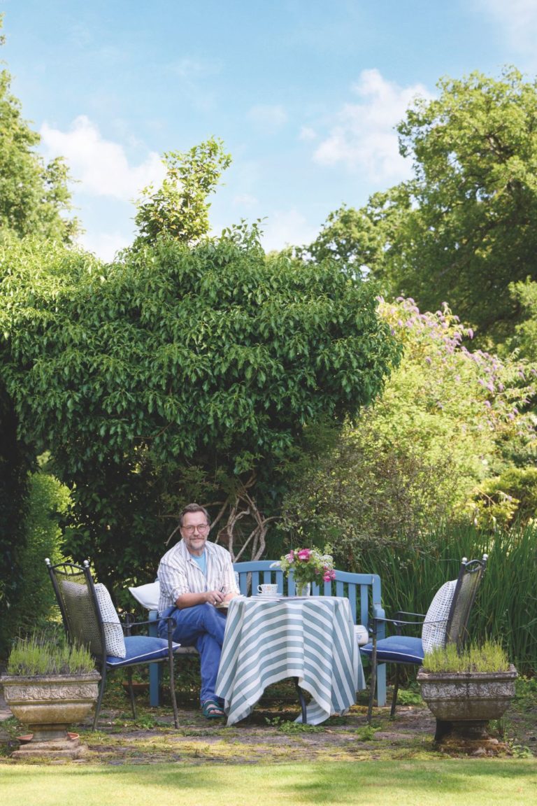
Interior consultant Patrick O’Donnell is incredibly skilled at doing decorator-y things for less. He never takes things too seriously in a room – a Nancy Lancaster-ism – and the way he hangs art and objects on walls creates playful architecture where there might not be any. Look up in his warm and cosy Worcestershire home and you’ll see plates exhibited above doorways. Art, candle sconces and brackets are arranged on the wall in a way that sets a tone of togetherness through precisely chosen colours – a language he understands so very well as a brand ambassador for Farrow & Ball.
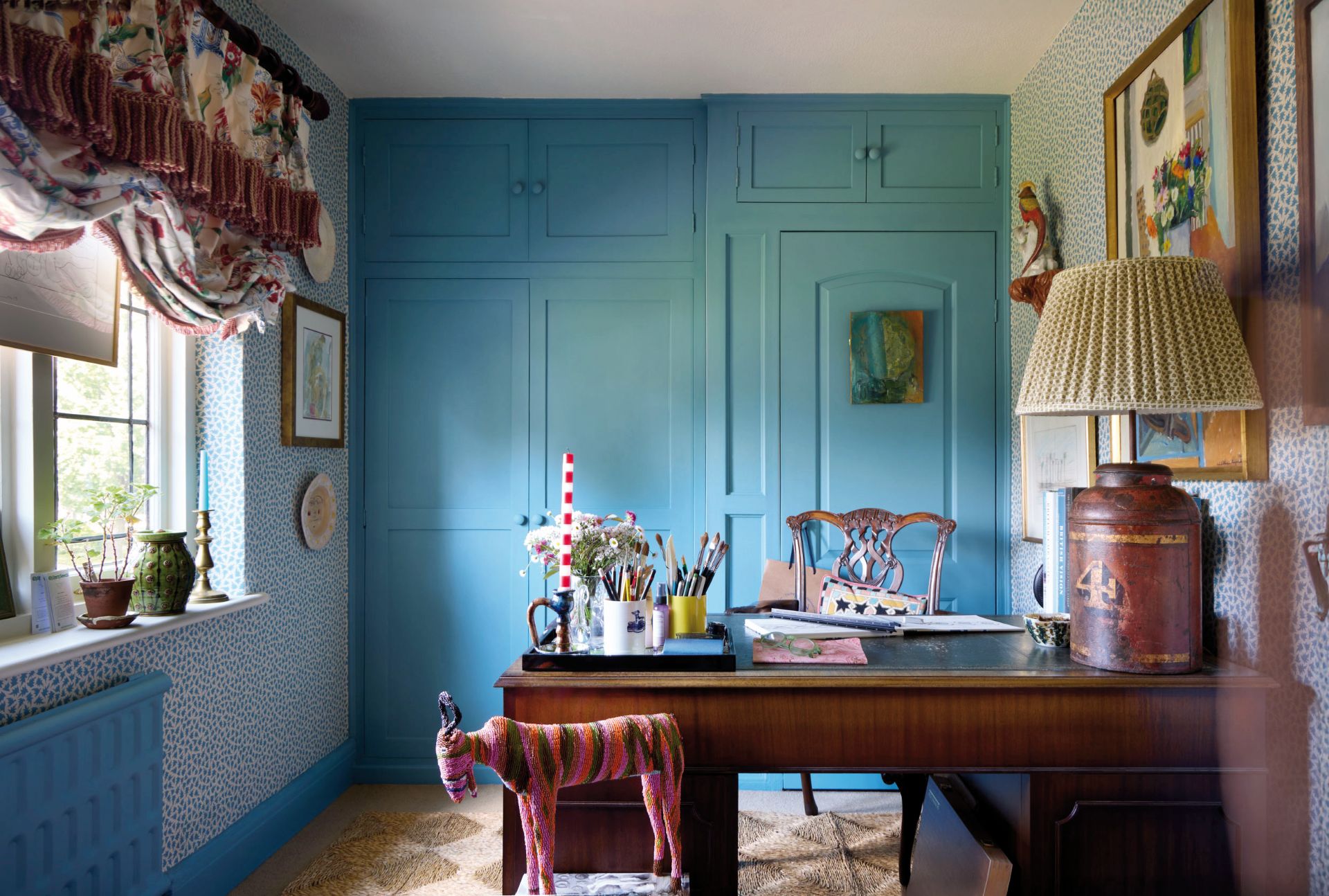
The woodwork is Farrow & Ball Stone Blue and the paper F&B Renaissance Leaves. ‘Bolder colour choices can be great fun.’ Beloved antique or inherited furniture works brilliantly with a pop of bright colour, so be adventurous.
Turn a corner in O’Donnell’s house and the interior scenery changes. Chromatic values shift, open up, and suddenly invite new patterns, furniture and energy. For visitors, it becomes a curated and comforting maze to explore. Almost too much, and definitely not too little.
Though colour is his life, O’Donnell stands by the notion that ‘different looks will naturally dictate different palettes and considerations’. He encourages clients to think very deeply about their aesthetic ambitions for a room and all the elements to be used in the space, from flooring to fabrics, tiles and more. The vibe will affect how colour appears; the same colour will feel different in a more minimalist room than in a layered, textural space full of pattern and print. Ultimately, O’Donnell suggests bringing in colour later in the design process. ‘You don’t want to be constrained by your colour choice. I always talk of colour in the room as the glue that unites everything, rather than the star of the show.’
Look Inside
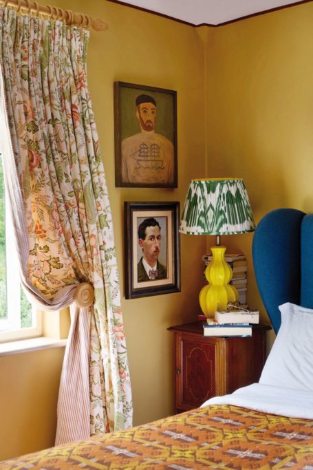
The yellow in the bedroom is Cane from the F&B archive palette. ‘It’s a good foil for all the overscaled brown furniture and truly comes into its own as the nights draw in but is cheerfully sunny on brighter days.’
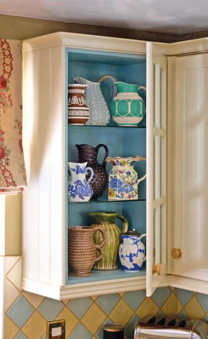
Patrick O’Donnell encourages painting the insides of cupboards and shelves for contrast.
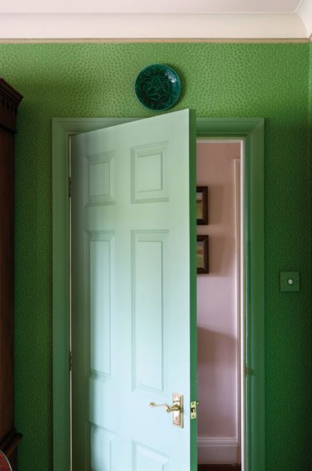
The door is painted Folly Green, another archive F&B colour, to match a discontinued Colefax and Fowler wallpaper called Livingstone. ‘The John Fowler mantra of “all greens go
together” came into my head so I ran with it.’
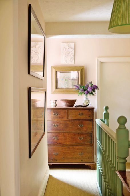
The hallway paint is Pink Ground by F&B. ‘I wanted something gentle but with a little warmth, as the space is all diffused light coming in from other rooms.’
Lessons For A Layered Home
Save colour for last…
The rooms people decorate for themselves tell very personal stories, and colour doesn’t need to dictate the narrative from the get-go. Colour is also very personal, but save it for last to give you more freedom with everything else.
Focus on the undertones in white paint…
When choosing colours, use whites that share a similar undertone to the wall colour or vice versa.
Be adventurous…
Bolder colour choices can be great fun, especially with the fifth wall, aka the ceiling. No longer an afterthought, the ceiling is very much part of the decorating repertoire. At the more subtle level, painting in a white that complements the wall colour or going off-piste with a bolder accent colour done well can be a triumph, and makes a wonderful design statement. You can even mix up the finish, using full gloss instead of the go-to emulsion like flat or eggshell.
Zone in…
If the room contains a niche for books, china or a piece of sculpture, adding a colour within the niche will help the piece shine. On a bookshelf, consider applying two colours, one for the exterior framework and a contrasting colour on the interior. Beyond creating visual interest, it is often just a subtle consideration when shelves are dressed with books and objets.
How to get colour to flow in your living spaces…
Pin down a colour family – this is a grouping on most colour cards from a paint manufacturer. Pick out some stronger colours that complement the chosen family to avoid the space feeling too bland.
Three principles for using colour…
- Lighter woodwork and darker walls.
- Darker woodwork and lighter walls.
- One colour all over, aka colour drenching.
The Layered Home by Benjamin Reynaert is published on 17 March (Clarkson Potter, £30).


