Everything You Need To Know About Cloud Dancer: Pantone’s Colour Of The Year 2026
By
3 months ago
Here's how to style the ethereal off-white shade
With previous years giving us Very Peri, Viva Magenta, Peach Fuzz and Mocha Mousse, the world has been waiting with bated breath to see which shade would clench the crown of Pantone’s Colour of the Year 2026.
Despite predictions of olive green and teal transformation, it seems that the team at Pantone had their heads in the clouds. The result? An ethereal shade of off-white named Cloud Dancer. While some are calling it a calming breath of fresh air, others have dubbed it bland, dull and tone deaf. From styling tips to expert insights, here’s everything you need to know about the Pantone Colour of the Year 2026.
Cloud Dancer: Pantone Colour Of The Year 2026
Laura James
The History Of Colour Of The Year
Pantone first introduced its colour of the year concept in 1999 in a bid to encourage conversation about how the worlds of colour and culture interact. ‘The Pantone Color of the Year has come to mean so much more than “what’s trending” in the world of design; it’s truly a reflection of what’s needed in our world today,’ explains Laurie Pressman, vice president of the Pantone Color Institute. ‘The selection involves thorough research and trend analysis, drawing influence from sectors like entertainment, fashion, travel, and technology.’
Pantone is drawn to the colour that seems to be growing most in importance across all areas of design – a colour with the ability to communicate what is happening in our global culture and reflects what people are looking for in their lives.
Want to know what colours other brands have chosen and why? Here’s everything you need to know.
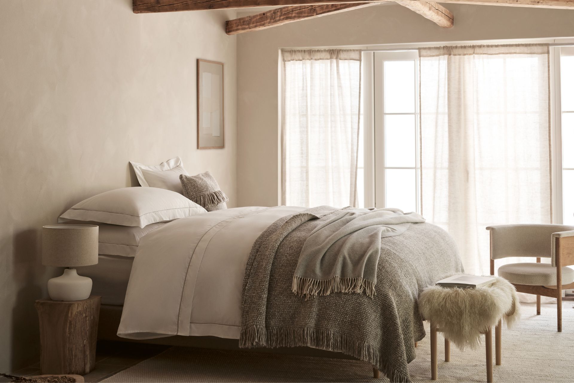
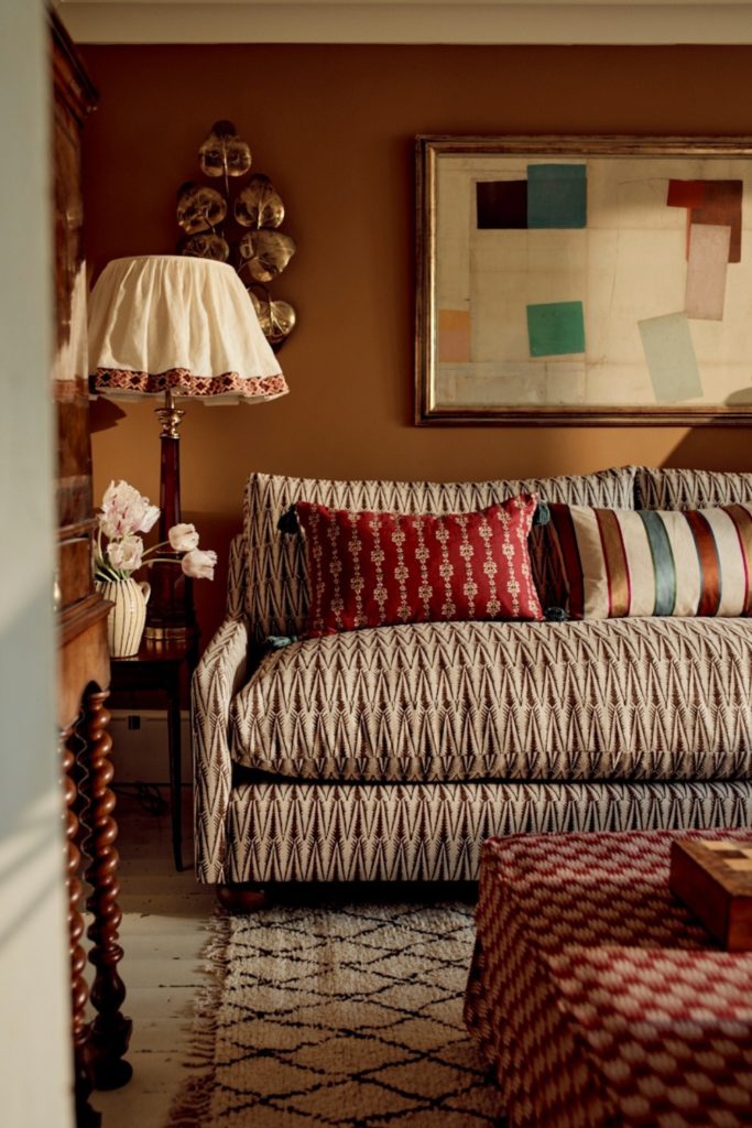
The White Company
Why Was Cloud Dancer Chosen?
With an infinite array of much brighter and bubblier colours to choose from, many have been left scratching their heads as to what credentials made Cloud Dancer right for the job.
The team at Pantone explain that we are currently living in an era of transition where people are seeking truth, possibility and a new way of living. Citing our overstimulating digital lives and 24/7 hustle culture, they noted that the world is currently ‘looking for respite and relief from emotional and physical stimulation by disconnecting and stepping away from the incessant demands of daily life’.
View this post on Instagram
A billowy white hue imbued with a feeling of serenity (Pantone’s words, not mine), the team explain that the ethereal feeling of Cloud Dancer ‘serves as a symbol of calming influence in a frenetic society rediscovering the value of measured consideration and quiet reflection’ – or to put it more plainly, a ‘whisper of calm in a noisy world’.
Imagined by the team as a blank canvas, executive director of the Pantone Colour Institute, Leatrice Eiseman, says: ‘Cloud Dancer is a discrete white hue offering a promise of clarity […] A conscious statement of simplification, Cloud Dancer enhances our focus, providing release from the distraction of external influences.’
Though Jenny Weiss from Hill House Interiors predicted something closer to a rust or burnt tobacco colour, she believes Cloud Dancer was chosen to represent the increasing focus on modern biophilic design. ‘This design philosophy emphasises creating spaces that feel alive and calm through a holistic connection, not just decoration,’ she explains. ‘It incorporates organic shapes, textures like wood, stone, and bark, and earthy, tonal palettes […] The core driver behind this trend is to improve health, reduce stress, boost concentration, and enhance recovery by connecting humans to nature’s restorative qualities.’
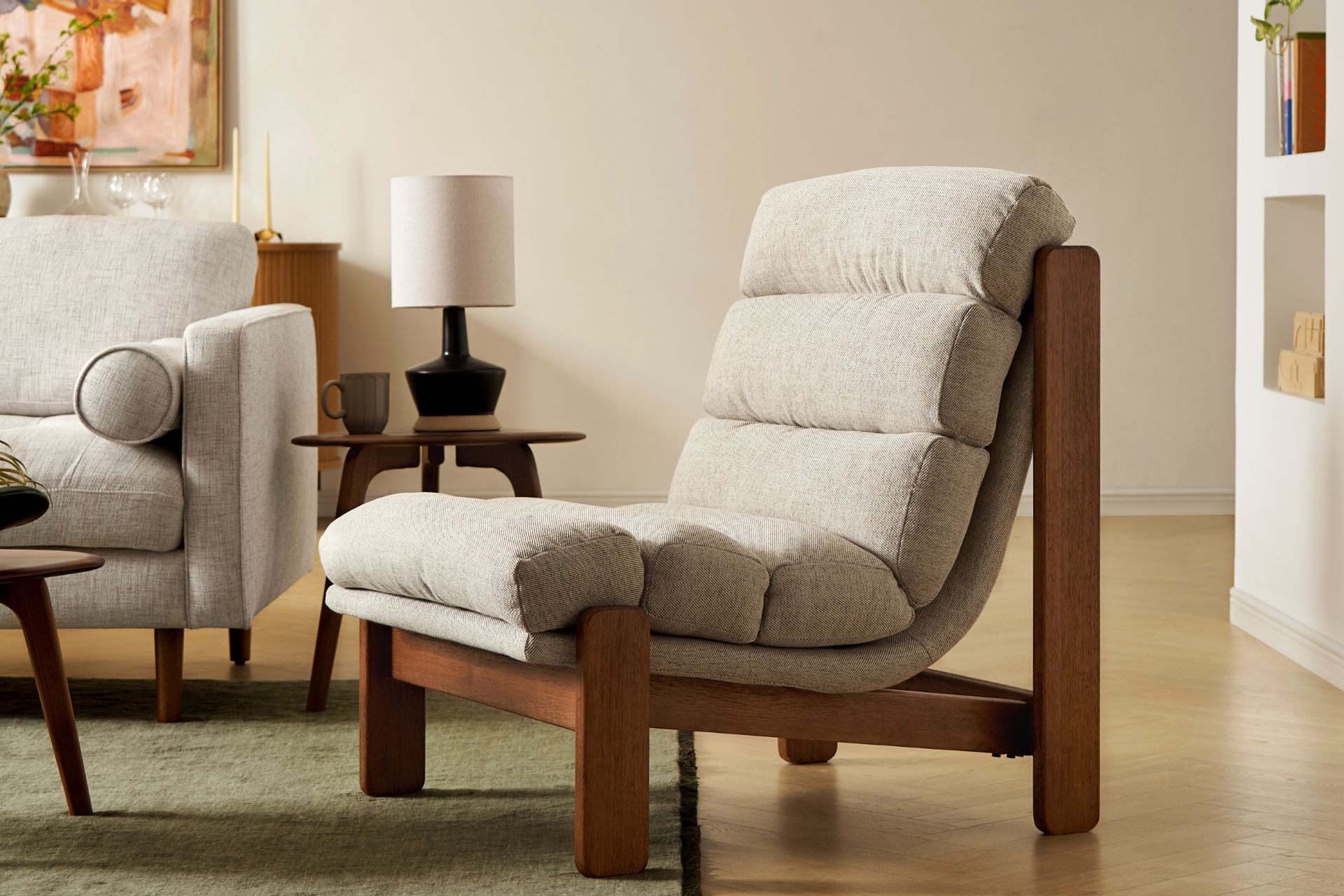
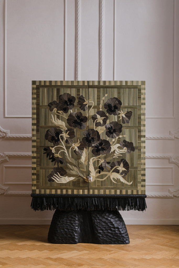
Castlery
What’s The Controversy With Cloud Dancer?
Despite the seeming simplicity of the shade, Cloud Dancer has already found itself embroiled in controversy, with criticism directed at Pantone for the apparent connotations made between whiteness and purity. Commentators online have branded the shade ‘Pantonedeaf’ and likened it to the controversial Sydney Sweeney American Eagle ad, with some backlash even claiming that the shade evokes white supremacy. Meanwhile, others have dubbed the shade a ‘recession indicator’, joking that ‘we can’t afford colour anymore’.
Responding to the claims, Pantone vice president Laurie Pressman told the Washington Post that ‘skin tones did not factor into this at all’, adding that similar allegations were directed to the Peach Fuzz and Mocha Mousse in 2024 and 2025, respectively.
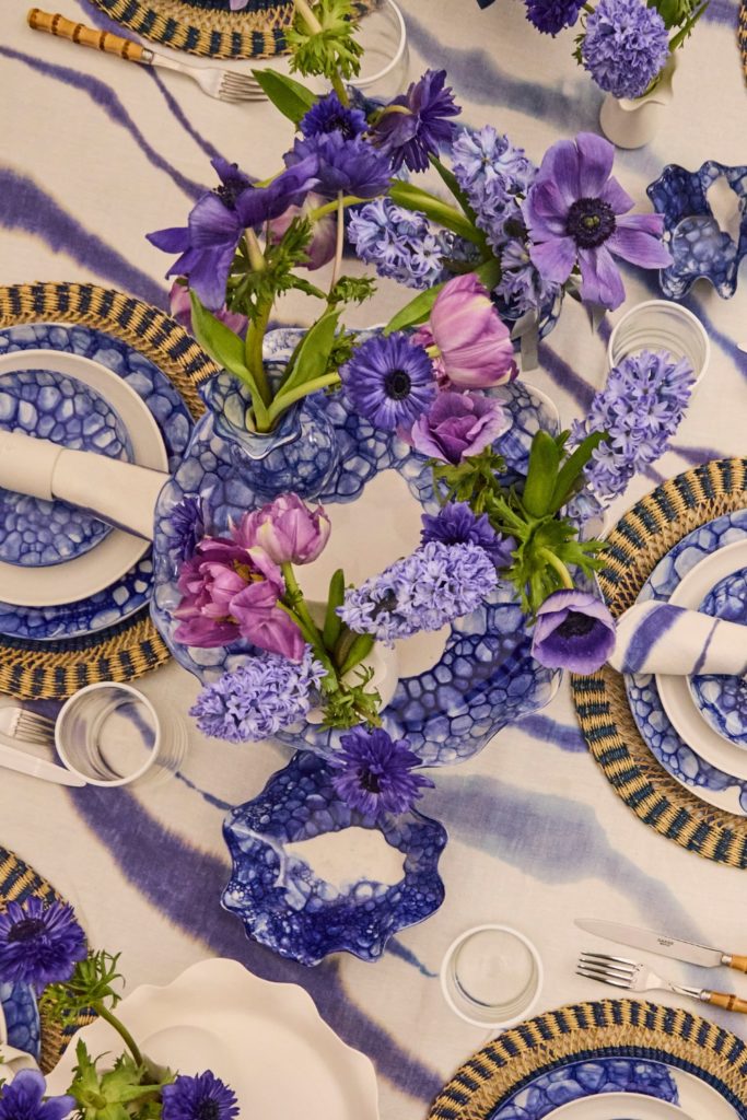
Furniture Village
What Do The Designers Think?
Cloud Dancer seems to have taken the design world by storm, with Jenny noting her ‘surprise’ at the reveal – especially ‘considering it’s technically not a colour’. However, she admits that she finds the shade ‘tranquil and serene’: ‘We use whites all the time in our designs and finding the perfect white can be very tricky. However the warm off white is a very nice tone.’
While the Pantone Colour of the Year always sparks conversation for the team at Martin Kemp Design studio, CEO Jemimah Graff says that this year’s shade feels particularly considered. ‘My first reaction was that it is a gentle and quietly optimistic colour,’ she says. ‘It has a softness that many people will find calming, but there is also a warmth that keeps it from feeling bland or overly safe.’
Despite her warm feelings towards the tone, Jemimah admits that she had expected something more saturated or dramatic, but concedes that the restraint of Cloud Dancer actually feels more powerful: ‘It bridges the ongoing desire for soft neutrals with a renewed appreciation for lightness and simplicity.’
As to why she thinks Pantone chose the shade, she notes that team at Martin Kemp are seeing a real appetite for colours, like Cloud Dancer, that create emotional ease. ‘I think Pantone’s choice reflects a wider cultural mood. After years of intensity and uncertainty, people are seeking ease, clarity and emotional balance in their homes. Cloud Dancer offers exactly that. It is adaptable, restful and subtly uplifting.’
Najwa Mroue of Atelier NM agrees. ‘Cloud Dancer instantly gives me soft and dreamy energy. It’s confident. Some people might say it’s just another white, but honestly? It’s the kind of white that makes everything else look more beautiful. It’s the perfect blank canvas.’
Barker & Stonehouse
While she (like Jenny) was also expecting a warmer terracotta shade, Najwa admits that Cloud Dancer surprised her in a good way. She feels Pantone is trying to tell us we all need a reset among all the negativity in the world. ‘Cloud Dancer feels like opening the windows and starting fresh. We are all craving calm vibes, and this colour delivers just that. […] It’s like Pantone said, Let’s not overthink it and …breathe.’
Though many were underwhelmed and outraged by the shade, for others Cloud Dancer is a dream come true. And The White Company (unsurprisingly) are particularly excited to see their eponymous shade finally given the credit it deserves. ‘This year’s Pantone Colour of the Year, Cloud Dancer, a soft, timeless shade of white, feels perfectly aligned with everything The White Company has believed in since the very beginning,’ says founder Chrissie Rucker, with what feels like a wink to camera. ‘For over 30 years, we’ve championed the calming, serene and beautifully understated power of white, celebrating its ability to bring warmth, tranquillity and effortless elegance to every home.’
How To Style It
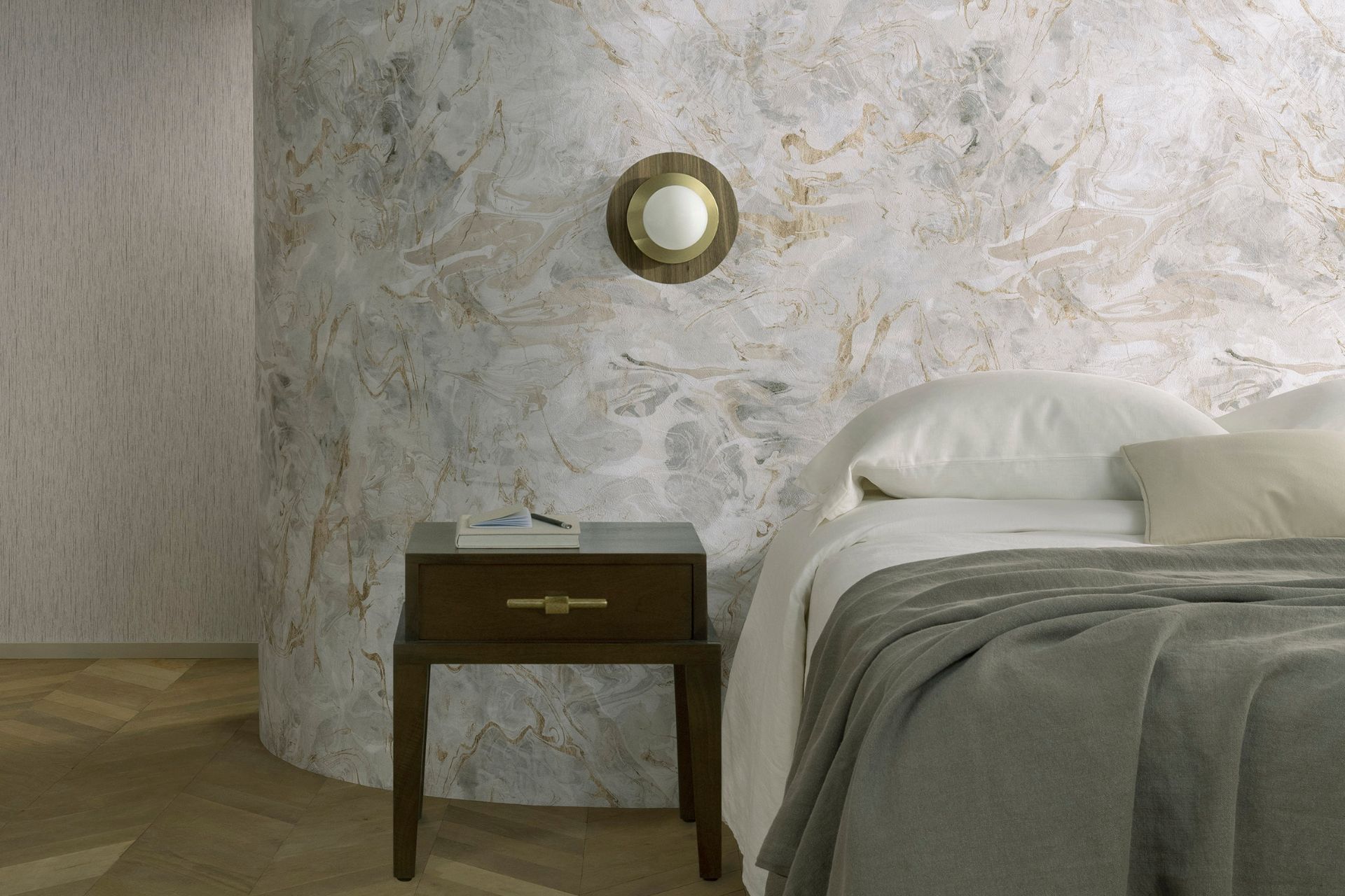
As opposed to a Viva Magenta or Peach Fuzz, it’s likely you’ve already incorporated Cloud Dancer, or a similar off-white shade, somewhere in your home. If, however, you wish to fully commit to the bit and embrace this 2026 trend to its fullest, you need to be careful to style this minimalist shade in a way which feels more blissful than bland.
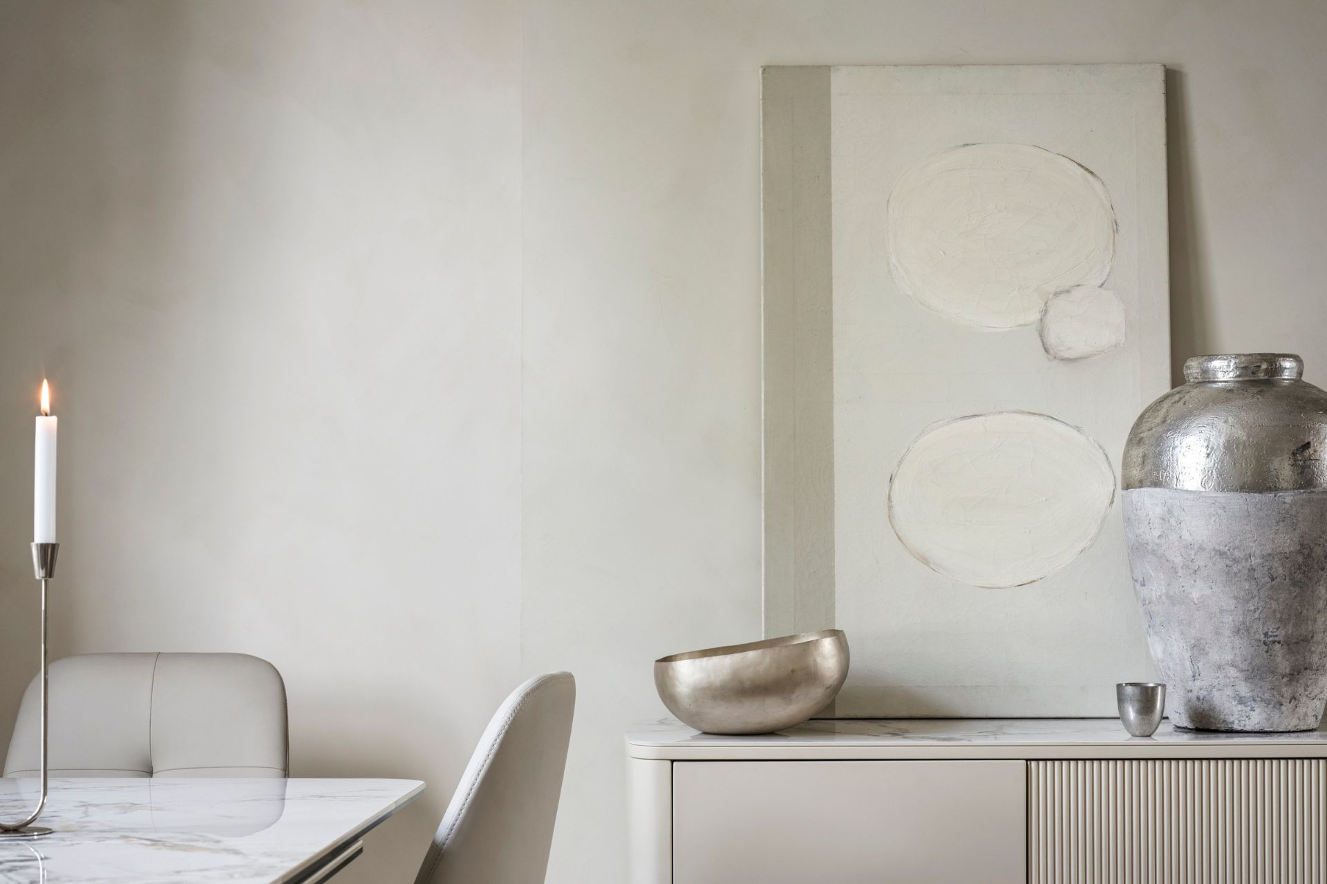
An expert in styling whites of all shades, if anybody can advise you on how to keep Cloud Dancer a lively addition in your home, it’s The White Company’s Chrissie Rucker: ‘I always choose a soft, soothing palette of whites, off-whites and neutrals, remembering that white is not one colour but a thousand tones and shades, all slightly and subtly different from each other.’ When it comes to your walls, she recommends opting for whites with character: ‘My favourite whites to use in the bedroom are Farrow & Ball’s All White, Benjamin Moore’s White Dove and Dulux’s Timeless. You can layer whites, too, using complementing shades on the walls and woodwork, to give more depth to the room.’
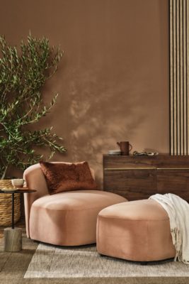
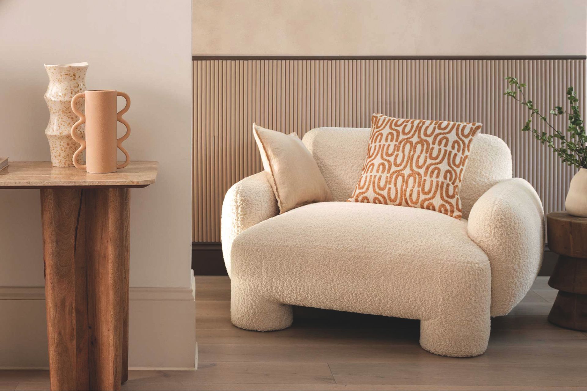
If, however, the all-white look isn’t for you, Jenny advises pairing the shade with other neutral or natural tones, or contrasting Cloud Dancer with darker tones for a bold and striking look. ‘I love using off-whites with pops of tans (think a white stool with beautiful tan leather fringing to the base as a skirt) and blonde wood tones to keep the schemes light, fresh, and refined. Alternatively, mixing it with deep rich browns or deep burgundy tones can add a statement and accentuate the depth of the accent colour when the white pops next to it.’
Clarke & Clarke
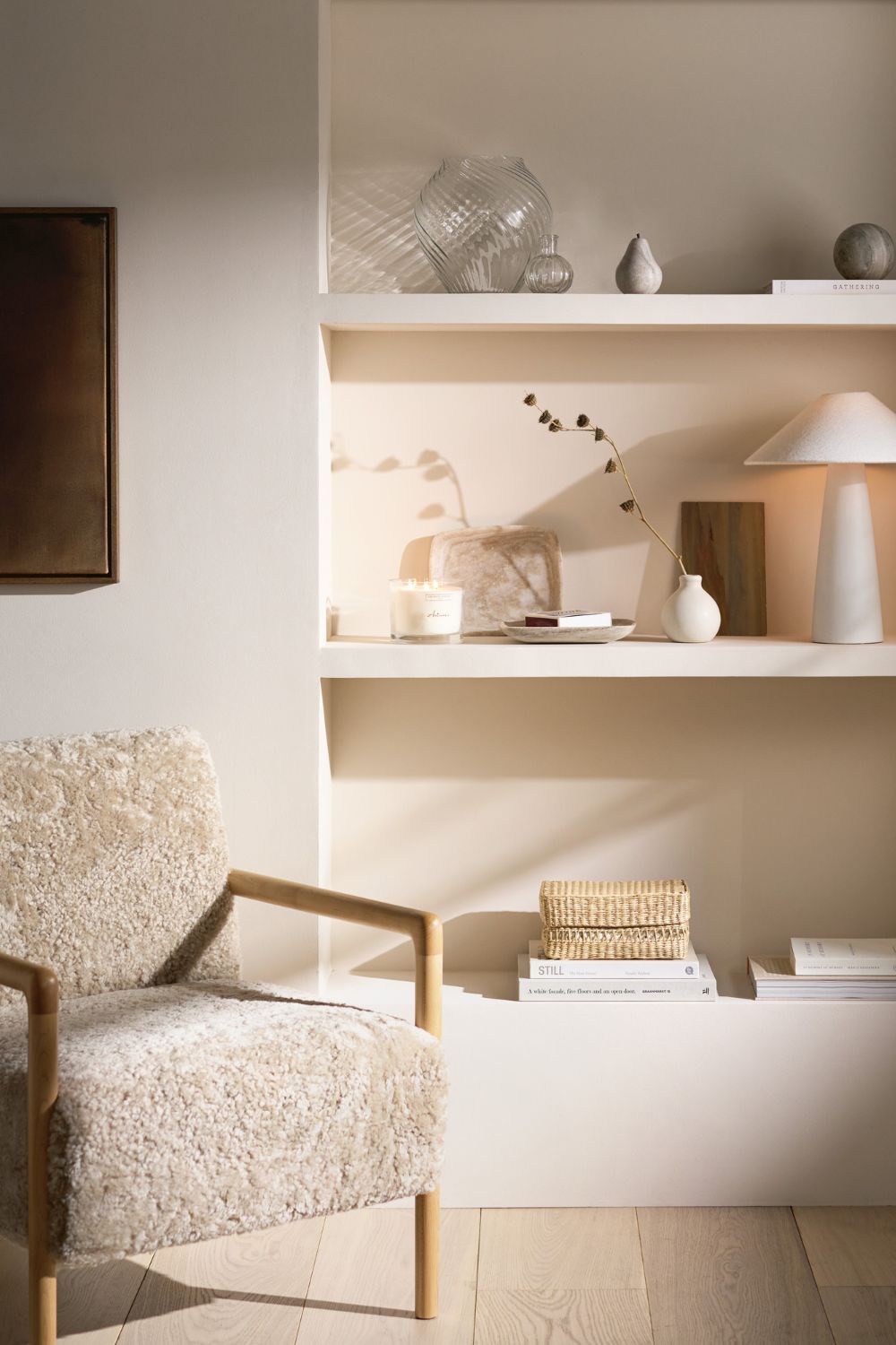
Texture is also key to making your whites look alive: ‘Think embroidered cushion covers, long-pile sheepskin rugs and quilted throws,’ says Chrissie. Jemimah agrees, adding that natural textures such as polished plaster, limestone, timbers and brushed metals add depth, while Najwa suggests embracing the cloud-like feeling with soft boucles, linens and fluffy rugs: ‘Anything that makes you want to touch it.’
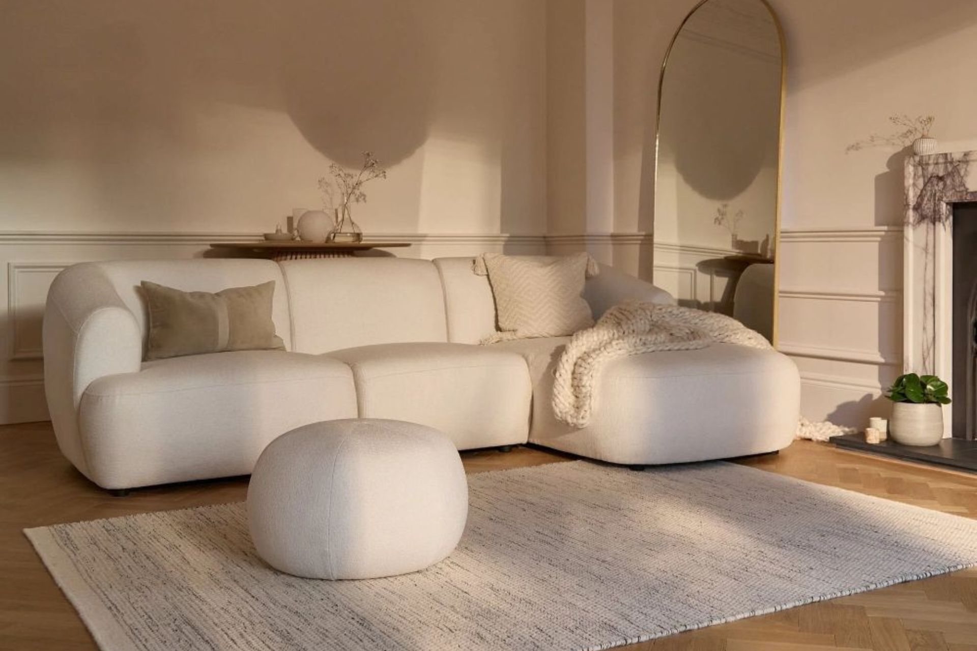
The perfect backdrop for any space, Najwa is keen to remind people that colour isn’t the only way we can inject interest into our homes: ‘Use sculptural pieces. Since the colour is subtle, let bold shapes take centre stage: curved sofas, chunky ceramics, oversized lighting…’, adding that the shade glows in natural light and can ban be brought to life at night with warm lighting. Chrissie similarly advises arranging long stems in glossy, white-glazed clay vases, or wildflowers in sandy-textured bud vases to use the shade in creative ways. ‘Opt for white pieces featuring geometric or organic shapes hand-pressed in papier-mâché, and frame them in warm mango wood for a subtle contrast.’